Quantcast
Channel: Code On Time
Viewing all 336 articles
Browse latest View live

Amazon S3 Upload/Download Adapter

$
0
0

Amazon Simple Storage Service (Amazon S3) is a cloud-based data storage solution. Let’s add fields to the Suppliers table in the Northwind database in order to store company logos. The picture file name, size, and content type will be saved in the database, while the files will be uploaded to S3.

Setting Up S3

Navigate to http://aws.amazon.com/s3 and log in to your account. If you do not have an active account for Amazon S3, sign up for AWS Free Usage Tier.

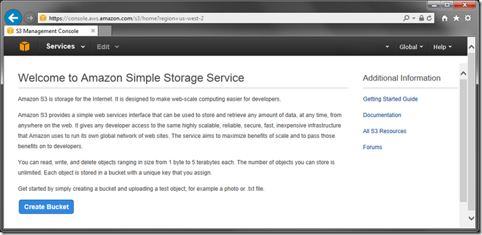
When logged into the AWS Management Console, select S3 under Storage & Content Delivery section. Click on Create Bucket.

Creating a bucket in Amazon S3.

Enter a bucket name and press Create.

Naming and creating the bucket.

When complete, click on the account name in the top right corner and select Security Credentials. Scroll down to Access Keys section. If necessary, create a new access key. Click on Show under Secret Access Key and save both the Secret Access Key and Access Key ID for later use.

Getting the access key for Amazon S3.

Adding Utility Fields to the Database

Start SQL Server Management Studio. In the Object Explorer, right-click on Databases / Northwind / Tables / dbo.Suppliers, and press Design.

Designing the Suppliers table.

Add the following columns:

Column NameData TypeAllow Nulls
LogoFileNamenvarchar(250)yes
LogoLengthintyes
LogoContentTypenvarchar(50)yes

Save the changes. Switch to the generator and click on the project name. Select Refresh, check the box next to Suppliers controller, and proceed to refresh the web app.

Refreshing the Suppliers controller.

Configuring BLOB Field

Start the Project Designer. In the Project Explorer, switch to the Controllers tab. Right-click on Suppliers / Fields node, and press New Field.

Creating a new field for Suppliers controller.

Assign the following properties:

PropertyValue
NameLogo
TypeByte[]
Allow Null Valuesyes
Value is retrieved on demandyes
Source FieldsSupplierID
On Demand HandlerLogoBlobHandler
On Demand StyleThumbnail
LabelLogo

Save the field. Drag the new field node and drop it onto Suppliers/ Views / editForm1 to instantiate the field as a data field in the editForm1 view.

Adding a data field of Logo to view 'editForm1'.     Logo data field added.

Drag the field onto view grid1 to display the picture in the list of products.

Next, double-click on the Suppliers controller node. Enter the following in BLOB Adapter Configuration.

BLOB Adapter Configuration

Field: Logo
Storage-System: S3
Access-Key-ID: AKIAJASDFSHLPC4B7P6Q
Secret-Access-Key: lNFaASDFyosrjY3j77ASDFCUTHj408Pgz5yoCci
Bucket: northwind
Path-Template: {SupplierID}-{LogoFileName}

Note that the values above are not functional. Replace the highlighted parts with your own settings.

Make sure to save the controller.

Viewing the Results

On the toolbar, press Browse. Navigate to the Suppliers page and start editing a record. The new Logo field will accept file uploads. Click on the link and upload a file. The bar at the top of the screen will show a confirmation of upload and a thumbnail of the picture will be displayed. The File Name, Length, and Content Type utility fields will be updated accordingly.

Image uploaded to Amazon S3 and thumbnail is displayed.

The files can be seen in AWS Management Console.

Files uploaded to Amazon S3.

To upload files larger than 4 MB, you will need to increase the application upload size limit.


File System Upload/Download Adapter

$
0
0

A local or remote file system is the most common method to store large binary content. Let’s implement a customer photo field in the Northwind database. Several utility fields in the Customers table will store file name, size, and type. The file itself will be stored in a specified folder location.

Adding Utility Fields to the Database

Start SQL Server Management Studio. In the Object Explorer, right-click on Databases / Northwind / dbo.Customers and press Design.

Designing the Customers table of Northwind database.

Add the following columns:

Column NameData TypeAllow Nulls
PhotoFileNamenvarchar(250)yes
PhotoLengthintyes
PhotoContentTypenvarchar(50)yes

Save the changes to the table.

Start the web application generator. Click on the project name, and press Refresh. Check the box next to Customers controller and proceed to refresh the web app.

Refreshing the Customers table.

Configuring BLOB Field

Start the Project Designer. In the Project Explorer, switch to the Controllers tab. Right-click on Customers / Fields node and press New Field.

Creating a new field in Customers controller.

Assign the following values:

PropertyValue
NamePhoto
TypeByte[]
Allow null values.yes
Value is retrieved on demandyes
Source FieldsCustomerID
On Demand HandlerCustomerPhotoHandler
On Demand StyleThumbnail
LabelPhoto

Save the field. Drag the new field node onto Customers / Views / editForm1 to instantiate a data field in the view.

Dropping the 'Photo' field node onto view 'editForm1'.     Photo data field instantiated in view editForm1.

Use the same technique to create a data field in view grid1 as well.

Next, double-click on the Customers controller node. Enter the following in BLOB Adapter Configuration.

BLOB Adapter Configuration

Field: Photo
Storage-System: File
Path-Template: C:\Northwind\Customers\{CustomerID}-{PhotoFileName}

Press OK to save changes.

Viewing the Results

On the toolbar, press Browse. Navigate to the Customers page and start editing a record. The new Photo field will accept file uploads. Click on the link and upload a file. The bar at the top of the screen will show a confirmation of upload and a thumbnail of the picture will be displayed. The File Name, Length, and Content Type utility fields will be updated accordingly.

Uploading a picture to Photo field in Customers controller.

The files can be seen in File Explorer.

The uploaded files are stored in the specified folder.

To upload files larger than 4 MB, you will need to increase the application upload size limit.

Introducing Tools for Excel

$
0
0

Code On Time application generator includes a Project Designer that allows drag & drop modification of project configuration elements. Project configuration is composed of pages, containers, data views, user controls, controls, controllers, commands, fields, views, categories, data fields, action groups, actions, business rules, styles, items, and field outputs.

Code On Time Tools for Excel is a Microsoft Excel add-in designed to provide a bird-eye view of project configuration element properties with the ability to make rapid and massive changes when needed. Users can change element properties, add, rearrange, and delete elements. A dedicated ribbon tab allows synchronizing changes with the project, modifying project settings, and generating entire applications straight from Microsoft Excel. Code On Time developers can switch between Project Designer and Tools for Excel, whichever tool is better for the task.

Getting Started

First, download and install both Code On Time application generator and Tools for Excel.

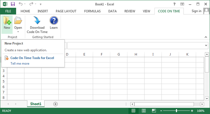
Start Microsoft Excel and open a blank workbook. On the ribbon, select Code On Time tab. Click on New button to create a new web app.

Creating a new project from Tools for Excel.

The application generator will start and display a list of project types. Proceed to create a sample Web Site Factory project named “Northwind” based on a sample Microsoft SQL Server database by following these instructions.

Creating a Web Site Factory project.

When application generation is complete, the web site will open in the default browser. Navigate to the Customers page. Let’s use Tools for Excel to make the following changes marked in the picture below:

  1. Change the title of the page to “Current Customer List”.
  2. Change “Company Name” column label to “Business”.
  3. Remove “Region” column.

Changes to be made in Customers page.

Using Tools for Excel

Switch back to Microsoft Excel. On the ribbon, select Open to see a list of existing projects. Select Northwind / Web Site Factory project from the list.

Opening a project in Tools for Excel.

A new sheet will be added, displaying instructions. The ribbon will display the project control buttons.

Project loaded in Microsoft Excel.

The table below shows descriptions of controls on the ribbon.

ControlTypeDescription
SyncButtonSync the current changes to project configuration files into the project. If errors are found, the sync will be canceled.
BrowseButtonGenerate and open the web application in your default browser.
ProjectButtonDisplay a menu of all available project actions.
DevelopButtonOpen the application source code in Visual Studio.
OpenButtonOpen the application project folder in Windows Explorer.
FilterDropdownClick here to apply a page or controller filter to all sheets.
PagesShortcutPages are the building blocks of the application, and host instances of data controllers (Data Views) and custom user controls (Controls).
ContainersShortcutContainers are placed on pages, and hold instances of data controllers (data views) and custom user controls (controls).
Data ViewsShortcutData views are instances of a data controller. Data views render views of the data controller on the page, along with corresponding data controller action groups. The same data controller can be exposed with data views on the same or multiple application pages.
User ControlsShortcutUser controls are the primary mechanism for extending the user interface of generated application pages. Instances of user controls (called controls) are placed in page containers alongside data views or other controls.
ControlsShortcutControls are instances of custom user controls that are placed in containers on a page.
ControllersShortcutControllers define metadata used by the application framework to retrieve data, present it to the users, and respond to actions in live applications.
CommandsShortcutA command provides a developer-friendly dictionary of SQL expressions that correspond to the individual fields and also define the base table and joined tables. The application framework uses the command text elements to compose Select, Update, Insert, and Delete statements at run-time.
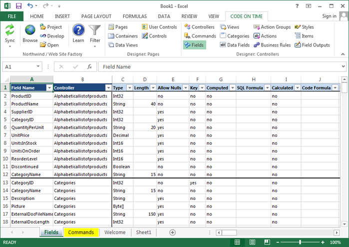
FieldsShortcutFields represent a piece of data in a record. It may either reflect data in a specific column, or it may be derived from a calculation. Fields are instantiated on views in the form of data fields.
ViewsShortcutA view is a configuration of the data controller composed of data fields and optional categories. Form views require all data fields to arranged in categories. Other types of views are incompatible with categories.
CategoriesShortcutCategories are used to group data fields in a view. They are only compatible with form views.
Data FieldsShortcutData fields are instances of fields in a view.
Action GroupsShortcutAn action group is a collections of actions placed in in a specific area of the user interface. Action group scope determines determines how the actions are rendered.
ActionsShortcutActions are rendered as buttons or action bar menu options in the user interface of the data controller view. The scope of the parent action group determines the part of the user interface that will display the action. Action commands with optional arguments are interpreted by the application framework. Custom actions can be processed with business rules.
Business RulesShortcutBusiness rules extend the functionality of a web application through SQL, C# or Visual Basic, JavaScript, or Emails.
StylesShortcutStyles are JavaScript expressions that evaluate to a true or false. When true, a CSS class is applied to the row.
ItemsShortcutItems represent static values for a lookup field.
Field OutputsShortcutField outputs specify the output location of a command that produces data.

Click Pages configuration shortcut on the ribbon. A new sheet will be added to the workbook containing all pages and their properties. Make the following change:

NameTitle
CustomersCurrent Customer List

Changing the Title of a page in Tools for Excel.

Next, click on Data Fields configuration shortcut on the ribbon. Then, set a filter by pressing Filter | Customers.

Filtering data fields down to "Customers" controller.

Set the Header Text of CompanyName data field in view grid1.

Field NameViewNameHeader Text
CompanyNamegrid1CustomersBusiness

Changing the Header Text of a data field.

Right-click on the leftmost column of Region data field row of view grid1, and press Delete Row.

Removing a data field from the Data Fields sheet using Tools for Excel.

The changes are not yet integrated into the project.  Press the large Sync button to synchronize all workbook sheets with the project. Alternatively, activate the dropdown and select a specific element type to synchronize.

Synchronizing project changes in Tools for Excel.

Tools for Excel will validate the data entered in the workbook. If any errors are found, the invalid data will be highlighted and synchronization will be canceled.

Invalid data is highlighted by Tools for Excel.

If the data is valid, Tools for Excel will save the workbook and submit data sheets to the application generator one-by-one.

Application generator will detect changes and modify project configuration elements accordingly. The updated project configuration data will be returned to Tools for Excel.

Tools for Excel will delete processed data sheets and replace them with fresh data received from the application generator. The workbook will be saved.

The changes have been synced for data fields and pages.

On the ribbon, press Browse to regenerate and open the web app in the default browser. Navigate to Customers page. Note that the title of the page has been changed, the second column has been renamed to “Business”, and Region column is no longer present.

The changes made in Tools for Excel have been applied.

Tools for Excel: Controllers

$
0
0

This is a typical view of controllers in a project.

Typical view of controllers in Tools for Excel.

Consult the following table when entering property values:

PropertyDescription
NameThis is the name of the data controller. If changed, the original data controller will be deleted. Rename the controller instead.
Conflict DetectionValid values are “Overwrite Changes”, “Compare All Values”.
Connection String NameSpecify a connection string name if the controller is working with the database other than the one selected for this project.
HandlerSpecify the name of a business rules class that can be extended to respond to the controller actions.
AnnotationsSpecify if free form notes and attachments can be assigned to any data row by end-users at run-time.
Status Bar

The status bar is displayed in form views to provide a visualization of the Status field.

Representational State Transfer (REST) ConfigurationDefines settings for the REST application server.
BLOB Adapter ConfigurationDefines the BLOB Adapter configuration.

Feature: Tools for Excel

$
0
0

Code On Time Tools for Excel provides an alternative designer that allows rapid changes to configuration element properties. This tool can be used interchangeably with the Project Designer.

List of data fields in Code On Time Tools for Excel.

The picture below shows the default Orders form in a sample Northwind web application. Let’s compare methods of changing the form layout in Project Designer and Tools for Excel.

Suppose that it is necessary to place shipping fields in a second column in the form. The word “Ship” must be removed from the field labels.

Default Orders edit form.

Using the Project Designer, you would create a category and drag all shipping data fields into the new category.

Dropping all shipping fields onto the 'Shipping Information' category.     All shipping data fields moved into 'Shipping Information' category.

Next, you would need to click on every data field, change the Header Text of the data field, and press OK to save.

You may save quite a few clicks using Tools for Excel.

Start Microsoft Excel, and switch to the Code On Time tab. Press Open | Northwind / Web Site Factory to link the project to the workbook, and then select Categories shortcut on the ribbon. Filter down to Orders controller by pressing Filter | Orders.

Filtering Categories project configuration sheet down to 'Orders' controller.

Add another category with the following properties:

IDViewControllerHeader TextDescriptionNew Column
myCateditForm1OrdersShipping InformationThis is the shipping info.yes

Adding a new category to Orders controller.

Next, click on the Data Fields shortcut. Make the changes highlighted below:

Field NameCategoryViewControllerHeader Text
ShipNamemyCateditForm1OrdersName
ShipAddressmyCateditForm1OrdersAddress
ShipCitymyCateditForm1OrdersCity
ShipRegionmyCateditForm1OrdersRegion
ShipPostalCodemyCateditForm1OrdersPostal Code
ShipCountrymyCateditForm1OrdersCountry

Changing the properties for all shipping fields in editForm1 of Orders controller.

On the ribbon, press Sync to apply changes to the application. Then, press Browse to generate and open the web app in the default browser. Navigate to the Orders page and select a record. The shipping fields will now be in a separate category in a new column with new labels.

Orders edit form with shipping information in a second column.

Learn more about Tools for Excel.

Overview of Upload/Download Adapters

$
0
0

Large files are frequently stored in databases as BLOB fields (binary large objects). Code On Time offers out-of-the-box support for upload and download of content directly to BLOB table columns. However, common practice is to store the binary content outside of the database. There are numerous advantages to this approach:

  • Reduced database size
  • Simplified backup
  • Low cost of storing large amounts of data
  • Opportunity to create a content delivery network (CDN)

File System

The most common method to store external files is in the file system. The files can be saved on the same hard drive of the host machine, or on an external Network-Attached Storage (NAS) device. While these devices are simple to configure, they still will require maintenance to ensure redundancy and performance.

Azure Storage

Microsoft Azure Storage cloud platform is a high-redundancy and availability solution that stores all data in data centers managed by Microsoft. It offers geo redundant storage, affinity groups, and logging. Each storage account can open multiple “containers” that are accessed via HTTP requests using unique container keys. Containers may be declared as “public” if necessary.

Amazon S3

Amazon Simple Storage Service (Amazon S3) is another popular cloud solution that offers features similar to Microsoft Azure Storage. It offers data redundancy and high availability, enabling rapid scaling of application infrastructure. Each account can create multiple buckets to store data, which are accessed via HTTP requests using one or more “Secret Access Keys”.

Configuring an Upload/Download Adapter

Declare virtual BLOB fields by entering a few parameters in the BLOB Adapter Configuration of a data controller. The web application framework will perform REST requests to a specified storage system, making it possible to use any combination of adapters in a single application without creating dependencies on third-party libraries.

A physical table column storing the file name is required for each virtual BLOB field definition. It allows the application framework  to determine existence of binary content.

Optional utility table columns Length and Content Type may be specified. The matching data controller fields will enable the application framework to communicate the file type and size to the client browser.

The table below shows configuration parameters that may be used to set up an adapter.

ParameterDescriptionStorage System
Access-Key-IDThe Access Key ID of the specified Secret Access Key required to form secure requests to Amazon S3.S3
AccountName of the Azure Storage Account.Azure
BucketThe bucket that stores the binary content.S3
ContainerThe container that stores the binary content.Azure
Content-Type-FieldThe name of the data controller field that stores the file content type (data type String).Optional
FieldThe name of the virtual BLOB field.Required
File-Name-FieldThe name of the field that stores the file name (data type String).Required
KeyThe key used to authenticate Azure Storage requests.Azure
Length-FieldThe name of the data controller field that stores the file length (data type Int).Optional
Path-TemplateThe path to the binary content in the storage system. May include references to data controller field names and special names. Required
Storage-SystemThe type of storage system that holds the binary content. Supported values are “File”, “Azure”, and “S3”.Required
Secret-Access-KeyThe Secret Access Key used in conjunction with Access Key ID to form secure requests to Amazon S3.S3

Configuring Path Template

The path template can reference data controller field names in curly brackets ({}). The following example references the data controller fields ProductID and PictureFileName. This path template will work with Azure and S3 storage systems.

Path-Template: Products/{ProductID}-{PictureFileName}

The file system path template must resolve as a physical path in the file system.

Path-Template: C:\Northwind\Customers\{CustomerID}-{PhotoFileName}

You can also specify a path relative to the application root when using file system storage.

Path-Template: ~\App_Data\Customers\{CustomerID}-{PhotoFileName}

Special names $Extension and $FileNameWithoutExtension can also be used in the path template with any storage system.

Path-Template: Products/{$FileNameWithoutExtension}-{ProductID}.{$Extension}

Most hosted storage systems (Azure, S3, Google Drive) are only supporting a limited set of characters in the path. The application framework will automatically replace non-alphanumeric characters with dash (-) when evaluating path templates.

Tools for Excel: Commands

$
0
0

This is a typical view of commands in a project.

Typical view of commands in a project.

Consult the following table when entering property values:

PropertyDescription
ControllerSpecifies the controller that the command belongs to.
EventSpecifies Event that will cause the command to execute. Note that the only supported command type for Select commands is Text.
IDSpecifies the ID of the command.
Table NameSpecifies the table name that must be used at runtime in automatically constructed insert, update, and delete data manipulation operations.
TextSpecifies the text of the command.
TypeSpecifies the Type of the command.

Tools for Excel: Fields

$
0
0

This is a typical view of commands in a project.

Typical view of commands in a project.

Consult the following table when entering property values:

PropertyDescription
Activate If BlankSpecifies that the lookup will be activated when the value is blank.
Allow NullsSpecifies that the field can blank.
CalculatedSpecifies that the the field value is produced by a business rule method. Context fields must be specified to cause the calculation.
Code DefaultSpecifies the default value that will be applied when the new record form is opened.
Code FormulaSpecifies a formula written in the programming language of the project that will return a field value.
Code ValueSpecifies a value that will be calculated every time the record is updated.
ComputedSpecifies that the field is not physically present in the table.
Context FieldsSpecifies which fields, when changed, will cause calculated fields to be refreshed.
ControllerSpecifies the controller the field belongs to.
CopySpecifies a list of fields that will be copied from the selected lookup item.
Data Format StringSpecifies the data format string for the value. Available strings are:Standard Numeric, Standard Date/Time, Custom Date/Time, HTML.
Data Text FieldSpecifies the field that will be displayed to the end user.
Data Value FieldSpecifies the field value that will be saved.
DefaultSpecifies the default value that will be applied when the record is saved.
Dynamic ConfigurationSpecifies fields that can provide dynamic values for the field properties.
Edit MaskSpecifies an edit mask that will validate the entered field value.
EditorSpecifies the name of a custom editor.
Field NameSpecifies the name of the field.
Format On ClientWhen disabled, specifies that the server will format the field using the supplied data format string.
HiddenSpecifies that the field is hidden in the user interface.
HTML EncodingSpecifies that the field value will be displayed in full. When disabled, HTML in the field will be rendered.
Items Data ControllerSpecifies the controller that will be used to look up data.
Items Data ViewSpecifies the view of the controller that will be used to look up data.
Items StyleSpecifies the style that will be used to display items.
KeySpecifies if the field is the primary key. The client library uses the primary key to select, update, and delete data.
LabelSpecifies the label that will be displayed in the user interface.
Last Entered ValueSpecifies that the most recently entered value by the user will be the default value for the next record. Simplifies mass entry of records with values that are not expected to change frequently.
LengthSpecifies the length of the field.
Lookup DescriptionSpecifies a description on the lookup window.
Mask TypeSpecifies the type of edit mask to be used.
New Data ViewSpecifies the view that will be used when the New Record icon is selected. If blank, the icon will not be displayed.
On DemandSpecifies that the field requires special handling.
On Demand HandlerSpecifies a name for an automatically created handler that will retrieve the blob field.
On Demand StyleSpecifies the method used to display the blob field. Available options are thumbnail and link.
Page SizeSpecifies the number of items displayed in the lookup view.
Query-by-ExampleEnables advanced filtering options for the field in grid views.
Read RolesSpecifies which roles are permitted to view the field.
Read-OnlySpecifies that the field is read-only.
Search by First LetterWhen enabled, displays quick first letter filters at the top of the lookup view.
Search on StartSpecifies that the lookup view will have advanced search bar open by default.
Show In SummarySpecifies that the field will be displayed in the summary when a record is selected.
SortingEnables sorting for the field in grid views.
Source FieldsSpecifies primary key fields that uniquely identify the source record.
SQL FormulaSpecifies a formula computed on the server that will return the field value.
Target ControllerSpecifies the controller data will be saved to when the field is configured as many-to-many.
TypeSpecifies the data type of the field.
Write RolesSpecifies which roles are permitted to edit the field.

Tools for Excel: Views

$
0
0

This is a typical screen displaying views in a project.

Typical screen displaying views in a project.

Consult the following table when entering property values:

PropertyDescription
Base View IdSpecify a Base View Id to inherit its data fields, categories, description, and label.
CommandSpecifies the command that will be used to select data.
ControllerSpecifies the controller that the view belongs to.
Filter ExpressionFilter Expression must be compatible with the back-end database server syntax. Data field names used in filter are automatically expanded into appropriate SQL expressions as defined in command.
GroupEnter any non-blank value in Group property to make sure that filters selected in a view are transferred to the other views in the same group when a user selects them in view selector.
Header TextSpecifies the text displayed above the view in the user interface.
IDSpecifies the unique identifier of the view.
LabelSpecifies the text displayed in the view selector dropdown.
Report Font

Property Report Font will determine the size of text for the data and labels in the report. The default value is Medium.

Report Label

Specify a Report Label that must print when a view report is produced in PDF, Excel, TIFF, or Word format. If the property left blank then the view label will be printed.

Report OrientationSet Report Orientation to "Portrait" or "Landscape" or let the application to decide what is best.
Report TemplateIndicate if a custom report template file must be created for this view. The report in RDLC format can be customized in Visual Studio or Visual Web Developer. The file name will be formatted as [Controller]_[ViewId].rdlc.
Override WhenOverride When is an expression that evaluates to true or false. It is written in the programming language of your project.
Show in SelectorIf disabled, the view will not be displayed in the view selector dropdown.
Sort ExpressionSort Expression is a list of data field names of this view, each followed by optional asc or desc suffix.
TypeType determines the presentation style. Available types include form, grid, chart, or data sheet.
Virtual View IDThe specifiedVirtual View ID will replace the current view when the condition in Override When is met.

Tools for Excel: Categories

$
0
0

This is a typical view of categories in a project.

Typical view of categories in a project.

Consult the following table when entering property values:

PropertyDescription
CollapsedWill render the category as collapsed by default if set to Yes.
ControllerThe controller that the categories’ view belongs to.
DescriptionThe text displayed under the header.
FloatingYou can force the category data fields to float from left to right by setting Floating to Yes.
Header TextThe text displayed at the top of the category.
IDThe unique identifier of the category.
New ColumnIf attribute New Column is set to Yes then the category is rendered in the new column.
TabSpecifying the tab will display a bar of tabs above the view and will make the category visible only when the tab is selected.
ViewThe view that the category belongs to.
VisibilityEnter a JavaScript expression in Visibility field to allow conditional display of the category. The expression must evaluate as true if the category is visible. Use square brackets to reference the data field values in the expression.

Tools for Excel: Data Fields

$
0
0

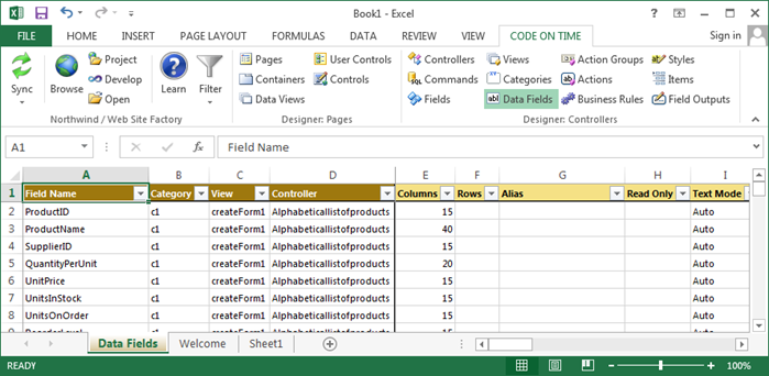
This is a typical view of data fields in a project.

Typical view of data fields in the project.

Consult the following table when entering property values:

PropertyDescription
Aggregate

Specify an Aggregate that will be displayed at the bottom of grid views.

AliasThe Alias is the field value that will be displayed to the user. The header text will be inherited from the alias field label.
Auto Complete Prefix LengthSpecify an Auto Complete Minimum Prefix Length greater than 1 to enable auto-complete on the data field.
CategoryThe category that this data field belongs to.
ChartIf the view is a chart, specify a Chart property that the data field will function as.
Code FilterSpecify an operator for the Code Filter to determine how records will be restricted from being displayed.
ControllerThe controller that this data field belongs to.
ColumnsColumns determines the width of the data field. If the field is a radio button list or check box list, this will determine the number of columns.
Data Format StringSpecify a Data Format String to format the field value before it is presented to the user.
Field NameThe name of the field that is instantiated.
Footer TextDisplayed under the field in the form.
Filter ExpressionWrite a Filter Expression in the programming language of your project. Code Filter must be specified.
Format On ClientIf Format On Client is disabled, the server will format the field using the specified data format string.
Header TextReplaces the name of the field in the form.
HiddenEnable to hide the field from the user interface.
Hyperlink Format StringThe Hyperlink Format String allows formatting the field as a link. Specify an absolute or relative (starting with ~) URL that may include field names enclosed in curly brackets. You can place _blank or any other standard window name followed by colon symbol in front of the URL.
Read OnlyIf Read Only is enabled, the data field will not be editable in the user interface.
Read Only WhenRead-Only When is a JavaScript expression that will enable editing on the data field when it evaluates to true.
RowsRows determines the height of the data field or list box.
Search ModeThe Search Mode property will control the behavior of the data field in the advanced search bar.
Search OptionsSearch Options represent the options available for searching the field in the advanced search bar. You can limit or reorder the search options. Search options must be compatible with the data type of the field. Separate options with "," or list one option per line. Examples: $contains, =, $between, >, $future.
TagUse the Tag property to define enhanced business purpose of the data field.
Text Mode

Text Mode will determine how the text box is rendered. Password will render the field value as asterisks. Rich Text will enable rich text editing on the field value. Note allows easy editing of long field values. Static will display the field as read-only, but still send the field value to the server.

Tool TipTool Tip is displayed when user mouses over the input box or text.
ViewThe view that this data field belongs to.
Visible WhenVisible When is a JavaScript expression that will display the data field when it evaluates to true.

Tools for Excel: Action Groups

$
0
0

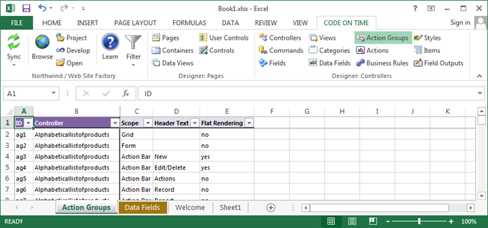
This is a typical view of action groups in a project.

Typical view of action groups in a project.

Consult the following table when entering property values:

PropertyDescription
ControllerThe data controller that this action group belongs to.
Flat RenderingFlat Rendering will display actions as individual items on the action bar. When disabled, they will be rendered in a dropdown menu.
Header Text

The Header Text is displayed when the group is rendered in a menu.

IDThe unique identifier of the action group.
Scope

The Scope determines the location and presentation of the action group.

  • Grid scope actions are displayed in the context menu of a grid.
  • Action Column scope actions are displayed in an action column on a grid.
  • Form scope actions are displayed in the action buttons row of a form.
  • Action Bar scope actions are displayed on the action bar of views of any type.
  • Row scope actions are displayed under a selected row in a grid view.

Tools for Excel: Actions

$
0
0

This is a typical view of actions in a project.

Typical view of actions in a project.

Consult the following table when entering property values:

PropertyDescription
Action GroupThe ID of the action group that the action belongs to.
Causes ValidationWhen Causes Validation is enabled, the form will be validated when the action is activated.
Command ArgumentThe Command Argument is used to modify the command. For standard Select, Edit, Update commands, specifying a view Id will perform the action in that view. For other actions, the argument can be used as a tag.
Command NameThe Command Name determines the behavior that will occur when the action is activated. If command name is not specified then the action is presented as a break line in the action group popup menu.
ConfirmationWhen not blank, Confirmation will display a confirmation window with the specified text. It may also used to call a modal form.
ControllerDisplays the parent controller.
CSS ClassSpecify a CSS class to assign to the action.
Data

Specify Data for the SQL, Report, or or Custom action. Application framework will use this information when processing the action.

DescriptionThe Description will be displayed under the Header Text on actions in a menu on the action bar.
Header TextThe Header Text will be displayed on the action. If not specified, the Command Name will be used.
IDThe unique identifier of the action.
RolesList roles allowed to execute this action in Roles. Role check is performed on the server and precedes the action conditions.
When Client ScriptWhen Client Script is a JavaScript expression that will display the action if it evaluates to true.
When HRefWhen HRef will display the action when the specified regular expression matches the page URL. If you would like to have a negative match then put "false:" without double quotes in front of the expression.
When Key SelectedIf When Key Selected is enabled, the action will only displayed when a record is selected.
When Last Command ArgumentWhen Last Command Argument will only display the action if the previous action has the specified command argument.
When Last Command NameWhen Last Command Name will only display the action if the previous action has the specified command name.
When TagWhen Tag will display the action when the view Tag is matched by the regular expression.
When ViewWhen View will display the action when the regular expression matches the view.

Tools for Excel: Business Rules

$
0
0

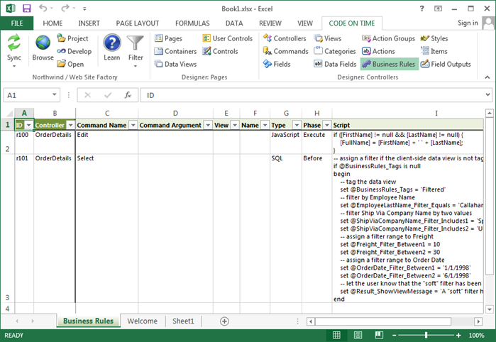
This is a typical view of business rules in a project.

Typical view of business rules in a project.

Consult the following table when entering property values:

PropertyDescription
Command ArgumentSpecifies a command argument that will allow trigger of business rule when command name is matched.
Command NameSpecifies the command name that will trigger the business rule.
ControllerSpecifies the controller that the business rule belongs to.
IDSpecifies the unique identifier of the business rule.
NameSpecifies a name for the rule.
PhaseSpecifies which phase the rule will be executed in.
ScriptSpecifies the script of the rule.
TypeSpecifies the implementation type. SQL, C# / Visual Basic, and Email business rules are executed on the server. JavaScript business rules are executed in the browser.
ViewSpecifies the view that the business rule will be triggered on when command name is matched.

Tools for Excel: Pages

$
0
0

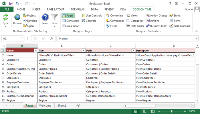
This is a typical view of pages in a project.

Typical view of pages in a project.

There are several rules that apply to modifying the Name and Path properties of pages in Tools for Excel.

Changing Path Of Child Page

Let’s change the text displayed on the menu option of Orders page. For example, the default path of Orders page is “Customers | Orders”.

Default value of Path for Orders page.

Change the text after the last “|” character to “Order List”.

Path property changed for Orders page.

On the toolbar, press Sync to apply changes.

The path property has been synchronized.

Changing Path of Parent Page

Changes to the text before the “|” character will have no effect. Always change the last segment of  the Path of the parent page to affect the child pages. For example, consider the effect of modifying the path of Customers page.

Default path of Customers page.

Change the path to “Current Customers”.

Changing path of Customers page.

Synchronize the changes, and all child pages will reflect the new parent.

The path of Customers and all child pages have been updated.

Removing Pages from Menu

To remove a page from the navigation menu of the generated web app, clear the Path property.

Clearing the Path property for Products page.

After synchronization, the page will be displayed at the bottom of the list of pages.

The products page will not appear on the menu and shows up at the bottom of the list.

Adding Pages to Menu

To add pages to the menu, enter a value in Path property.

Entering a value in Path property.

The page will be reinserted at the bottom of the list of pages.

The Products page has been readded to the menu and is reinserted at the bottom of the page.

Renaming

Use the Rename function in Project Designer instead to preserve the configuration.

Do not change the page Name if you want it to be renamed. The application generator will remove the existing page and insert a blank page with the new name.

Moving

Rearranging of pages is not supported in Tools for Excel. Please use the Project Designer instead.

Reference

Consult the following table when entering property values:

PropertyDescription
About This PageThe text displayed in the "About This Page" sidebar element.
Custom StyleMultiple custom Styles can be applied to the page in order to apply custom styling. The styles are space separated.
DescriptionDescription is displayed as a tooltip for the page on the navigation menu.
Master PageSpecifies the name of a custom Master Page.
NameThe name of the generated physical page.
PathSpecifies the location of the page in the navigation hierarchy. When left blank, the page will be hidden from the menu.
Roles

Make a comma-separated list roles that are permitted access to the page. Use ? to allow anonymous access to the page. Use * to display the page on the menu for anonymous users, but require them to log in to access the page.

StyleChoose a standard CSS Style to apply to the page. The standard stylesheets will change the icon displayed in the top left corner of the page.
TitleThe text displayed in the browser window header.
URL

The URL will create a menu link to an external web page. No page will be created when this property is specified.


Code On Time Tools for Excel, Upload/Download Adapters

$
0
0

Code On Time release 7.0.8.0 introduces support for Tools for Excel.  This new alternative development environment is an add-in for Microsoft Excel 2010 - 2013. It provides a bird-eye view of project configuration element properties with the ability to make rapid and massive changes. Download Tools for Excel at http://codeontime.com/releases/tools-for-excel and use them alongside the Project Designer built in the application generator.

Application framework in the core of web apps created with Code On Time now supports virtual binary fields that can be stored in the File System, Windows Azure Storage, or Amazon S3. Store your binary content in the external storage systems without writing a single line of code with the  help of upload/download adapters. Adapters are implemented without dependencies on the external libraries. All communications with external storage systems are performed through the corresponding REST APIs.

The following features and enhancements were introduced in the new release:

  • Code On Time Tools for Excel
  • File Upload/Download Adapters
  • jQuery 1.9.1 and jQuery UI 1.10.2 are now integrated in the client library.
  • Metadata Builder has been enhanced to support cross-synonym references for Oracle databases.
  • Auto-refresh of data views will automatically sync a view to show the last selected data row. Auto-refresh will not be performed on form views.
  • Implementation of ActionResult.ShowModal will correctly display modal views of the current controller.

The next release with the new preview of the second generation data sheet view will go out soon. We expect to introduce Mobile Client Library and upload/download adapter for Google Drive in May of 2013.

Tools for Excel: Containers

$
0
0

This is a typical view of containers in a project.

Typical view of containers in a project.

Consult the following table when entering property values:

PropertyDescription
CSS Class Name

Assign a CSS Class Name to apply custom styling.

CSS Style PropertiesAssign CSS styling to the container in CSS Style Properties.
FlowThe way that the container will be positioned on the page is determined by Flow property.
IDSpecifies the unique identifier of the container.
PageSpecifies the page that the container belongs to.
WidthWidth can specify the percent of the total page or an exact width in pixels for the container.

Tools for Excel: Data Views

$
0
0

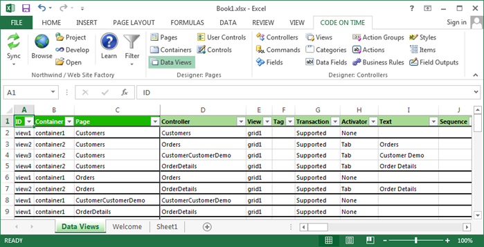
This is a typical view of data views in a project.

Typical view of data views in a project.

Consult the following table when entering property values:

PropertyDescription
ActivatorSpecify a method to access the data view in Activator property. The available options are Tab, Side Bar Task, and Site Action.
Auto Hide

Property Auto Hide specifies which user interface element will be hidden if filter value is empty.
Self will hide just the data view. Container hides the entire container that the data view resides in (including all other data views in the container).

Auto Highlight First RowAuto Highlight First Row will automatically select the first row in the grid view.
Auto Select First RowAuto Select First Row will automatically execute the first action in the action group with the scope of "Grid".
ContainerThe container that the data view belongs to.
ControllerSpecifies the controller that the data view will display.
CSS Class NameProperty CSS Class Name will be assigned to the div element on the page that represents the data view.
Filter Field 1Enter the first field that will limit the visible data.
Filter Field 2Enter the second field that will limit the visible data.
Filter Field 3Enter the third field that will limit the visible data.
Filter Field 4Enter the fourth field that will limit the visible data.
Filter Field 5Enter the fifth field that will limit the visible data.
Filter Source

Enter the master data view in Filter Source.

IDThe unique identifier of the data view.
Multi SelectEnable Multiple Row Selection by setting Multi Select to "Multiple".
Page Size

Specify the number of data rows displayed in Page Size.

Refresh IntervalRefresh Interval specifies how many seconds will pass before the data view is refreshed. If blank, the data view will not refresh automatically.
RolesEnter a comma-separated list of Roles to that will have permission to view the data view.
Search by First LetterProperty Search By First Letter enables a dynamic menu of first characters above the "grid" views.
Search On StartEnable Search On Start if you want non-form views to display an automatic search bar instead of the first page of data. Use Search Mode properties of view's data fields to control the contents of the search bar.
SequenceSpecifies the order that the data view will be placed in.
Show Action Bar

Unselect Show Action Bar to hide the action bar.

Show Action ButtonsSpecify where the action buttons are displayed using Show Action Buttons.
Show DescriptionUnselect Show Description to hide the view description on the page.
Show Details in List ModeWhen property Show Details in List Mode is enabled, child views will be refreshed when a row is selected in the grid. When disabled, child views will be refreshed when opened in the form.
Show In Summary

Select Show in Summary to include data fields of the view in the summary properties displayed on the side bar.

Show Modal Forms

Show Modal Forms will force any actions that bring up a form to have the form displayed in a modal form. If the option is not selected then the form will be in-line.

Show Page SizeUnselect Show Page Size to hide the page size section at the bottom of the data view.
Show PagerUnselect Show Pager if you want to hide the pager area of the data view.
Show Quick FindProperty Show Quick Find controls if the Quick Find search box is displayed on the action bar.
Show Row NumbersEnable Show Row Numbers to display row numbers on the left side of the data view.
Show View Selector

Unselect Show View Selector to hide the view selection dropdown on the right side of the action bar.

Start Command ArgumentSpecifies an argument for the startup action.
Start Command NameThis action is executed as soon as data view has been initialized on the page in a browser. Only New, Edit, and Select actions can be executed.
TagUse Tag to enabled conditional controller actions with matching whenTag property and to write custom business rules specific to tagged data views.
TextSpecifies the text displayed on the activator.
TransactionSpecify if transactions are supported in this data view.
ViewSpecifies a view to display from the specified controller. If left blank, the first view will be used.
Visible WhenEnter JavaScript expression in Visible When if you want a conditional display of the view on the form. Use the word Master to reference the data view specified in the Filter Source property of this data view.

Tools for Excel: User Controls

$
0
0

This is a typical view of user controls in a project.

Typical view of user controls in a project.

Consult the following table when entering property values:

PropertyDescription
NameSpecifies the name of the user control.
PrefixSpecifies the prefix of the user control.
GenerateSpecifies when to re-generate the user control.
BodySpecifies the user control markup.

Tools for Excel: Controls

$
0
0

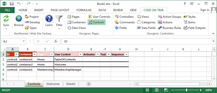
This is a typical view of controls in a project.

Typical view of controls in a project.

Consult the following table when entering property values:

PropertyDescription
IDThe unique identifier of the control.
ContainerThe container that the control belongs to.
PageThe page that the control belongs to.
User ControlThe user control that will be instantiated.
ActivatorSpecify a method to access the data view in Activator property. The available options are Tab, Side Bar Task, and Site Action.
TextSpecifies the text displayed on the activator.
SequenceSpecifies the order that the user control will be placed in.
Viewing all 336 articles
Browse latest View live


<script src="https://jsc.adskeeper.com/r/s/rssing.com.1596347.js" async> </script>