Quantcast
Channel: Code On Time
Viewing all 336 articles
Browse latest View live

Account Manager: Managing Account

$
0
0

Navigate to http://manage.codeontime.com/pages/myaccount.aspx.

Notice that there are two tabs available. The first tab, called “User”, allows you to modify your personal account information.

The first "User" tab displays information for the current user account.

Activate the Change Password button on the action bar. A confirmation form will appear.

The Change Password modal confirmation form.

Enter your old password in the relevant field. Then, enter a new password and confirmation, new question and answer, or both. Press OK to change your account.

Switch to the Company tab. Press Edit, and enter your company information for reference purposes.

Editing company information for the account.


Account Manager: Overview

$
0
0

The account manager is a free service provided by Code On Time that allows product owners to manage users, activation codes, and projects. It integrates with the app generator to allow synchronization of Project Designer changes.

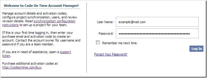
Navigate to https://manage.codeontime.com to access the Account Manager. If you have not yet created an account, enter your payment email and activation code. Otherwise, enter your account credentials and press Log In.

Logging in to Code On Time Account Manager.

After logging in, the site menu will display options available to you, depending on your role.

The site menu after logging in.

The Projects and My Account pages are available to all users.

The Projectspage displays a list of synchronized projects in your account. Any user can see projects assigned to them, as well as project revisions. If you are an Account Owner or Project Manager, you can also delete or restore projects and revisions.

The My Accountpage displays details of your account. From here, you can change your password or password question and answer. If you are an Account Owner, you may also change details of your company.

The Users and Purchases pages are only available to Account Owners.

The Users page allows adding, editing, disabling, and deleting new users, as well as generating and emailing new activation codes.

The Purchases page displays the current purchases that your account is tied to. From here, you can add a new purchase to your account.

Mobile Database Apps for iPhone/iPad/Android, Visual Studio 2013

$
0
0
Code On Time release 8.0.2.0 introduces an updated Universal Mobile/Desktop Client in the apps created with Premium and Unlimited editions. The new mobile client offers editing capabilities and Responsive Web Design. The same exact app will take a full advantage of the client mobile device and offer the most efficient method of presenting data. Continue reading for full release notes after the screen shots.
See the live mobile demo at http://demo.codeontime.com/northwind/pages/home.aspx?_mobile=true.
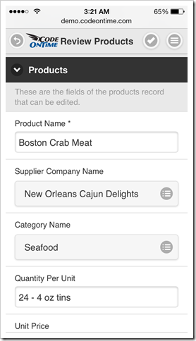
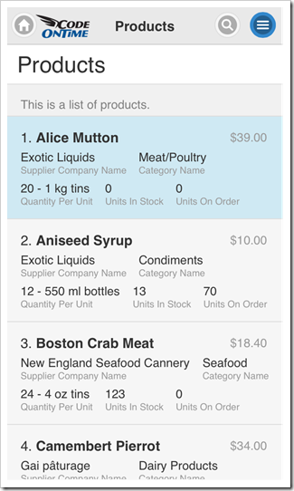
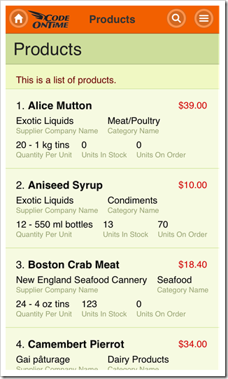
These are the screen shots of iPhone 5s with the product list and a single product in an edit form.
Mobile client rendering of a product list in the app created with Code On Time app generator.  Mobile client rendering of an edit form 'editForm1' in the app created with Code On Time app generator.
Modern tablets feature high resolution screens. iPad Air with portrait orientation in shown in the screen shot below with the display of the same product list. List items are wider and a fixed context sidebar is automatically visible on the right-hand side of the screen.
Mobile client rendering of a product list in iPad Air with visible context sidebar in the app created with Code On Time app generator.
This screen shot shows the product list in iPad Air with landscape orientation. The context sidebar has been undocked to offer three columns of list items.
Mobile client rendering of a product list in iPad Air with landscape orientation in the app created with Code OnTime app generator.
Don’t forget that apps created with Unlimited edition also support Desktop client devices. See the desktop version of the demo at http://demo.codeontime.com/northwind/pages/home.aspx?_mobile=false.
Mobile client rendering of a product list in iPad Air with landscape orientation in the app created with Code OnTime app generator.
Application framework automatically detects the type of client device and hooks either mobile or desktop client library to rendered application pages ensuring the most friendly presentation.
The following features and bug fixes are included in this release:
  • Updated mobile client library with full editing capabilities and Responsive Web Design.
     
  • Production release of jQuery Mobile 1.4 is the foundation of the mobile client library.
     
  • Visual Studio 2013 is now supported.
     
  • Windows Azure SDK 2.2. is now supported.
     
  • Client library supports "lookup-details-hidden" tag to hide "arrow" that allows view object details from lookup fields.
     
  • Thumbnails of images are now rendered on transparent background. Previous releases where rendering images with white background and thin gray frame.
     
  • Web.Config.Release and Web.Config.Debug transformations are now supported in Web App Factory and Azure Factory apps.
     
  • Application page builder will prevent creation of duplicate pages and configure the first foreign key field as Filter Source field if multiple FK fields are referencing the same controller.
     
  • Import processor passes the name of the temporary file to ImportProcessorFactory to allow overriding and correction of the submitted import file.
     
  • Import processor will automatically bind records imported into child data views to the primary key of a selected master on any level of hierarchy.
     
  • Thank you Ed Blum for contributing "nl-NL" enhanced localization.
     
  • Method DataViewExtender.AssignFilter will accept an array of values for Include and Exclude filters.
     
  • Removed extraneous ")" from the project build file that was preventing Web App Factory from generating the Login page.
     
  • Spansh style of "a.m./p.m" designator is using "space" in the middle on Window 8.1. The client library will correctly parse time.
     
  • Legacy apps without /project/features/framework/@scriptOnly set to "true" in DataAquiarum.Project.xml file will not try to render Mobile Client.
     
  • Desktop client correctly positions Calendar in all browsers.
     
  • Desktop client correctly processes selected lookup values in FireFox.
     
  • Desktop client does not apply the URL command parameters to object Details when a user clicks on an arrow.
     
  • Removed "x" button in IE10 and above in desktop apps.
Next release is planned for January of 2014. There will be numerous enhancements to the mobile client to further narrow the gap between Desktop and Mobile features. Here is a partial list of things we are working on:
  • Blob upload/download.
  • Confirmation data controllers
  • Multi-field copy and context fields in lookups.
  • Dedicated presentation for Auto Complete, Check Box, and Check Box List lookup styles.
  • Filtering capabilities.
  • Mobile version of Advanced Search Bar.
  • Display of aggregates in context sidebar.
  • “Tabular” display of data lists.
  • Multiple-selection of list items.
  • Conditional visibility of categories and fields.
  • Conditional read-only fields.
  • Calculated fields.
We are also preparing to showcase http://cloudontime.com. We have done tremendous amount of work to bring built-in dynamic page creation, workflows, blogging and support forum capabilities to the apps created with Unlimited edition of Code On Time. Stay tuned.

Mobile Responsive Web Design

$
0
0

A mobile application created with Code On Time has a Responsive Web Design. User interface is automatically adjusted for optimal viewing experience on any client device.  Generated applications will run equally well in modern HTML5 browsers of smart phones, tablets, and desktop computers.

Consider the mobile demo built on top of the Northwind database to explore Responsive Web Design in action. The fluid application user interface is shown on Apple iPhone 5, Apple iPad Air, and Google Nexus 7.

iPhone 5

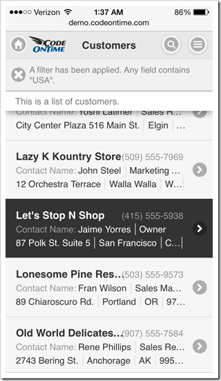
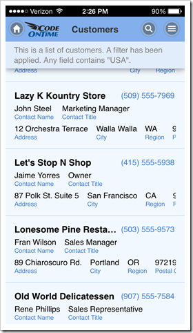
The following screen shot shows iPhone 5 with a list of products. A customer record is selected. The phone numbers of all customer are clearly visible with the business names partially hidden. A label is displayed next to the contact names. Partial address of customers is listed in the the last row of each list item. Context menu and  search icons are visible on the right-hand side of the  toolbar.

Mobile app created with Code On Time displayed in portrait orientation on Apple iPhone 5s.

Change the phone orientation to landscape. A full name of each customer is now visible. An additional label shows next to the contact title. Application toolbar also features two additional icons “Edit” and “Delete”.

Mobile app created with Code On Time displayed in landscape orientation on Apple iPhone 5s.

Tap the selected record or click “Edit” icon on the toolbar and switch to portrait orientation.

The selected record is now displayed in a form view. Labels are positioned on top of field values. Icon “Edit” is displayed on the toolbar next to the “Context Menu”  button.

Form view of a mobile app created with Code On Time displayed in portrait orientation on Apple iPhone 5s.

Click “Edit” button and change orientation of the mobile device to landscape. Labels are now positioned on the left side of the corresponding fields. Two additional icons “OK” and “Delete” are visible on the toolbar.

Form view of a mobile app created with Code On Time displayed in landscape orientation on Apple iPhone 5s.

Action buttons are displayed in the form views with additional shortcuts duplicated on the toolbar. If the text of a button is too long, then the button icon is migrated to the top while the text is displayed at the bottom of a button. You can see this in action in the screen shot of the same mobile app with a Spanish localization.

Form view of a localized mobile app created with Code On Time displayed in portrait orientation on Apple iPhone 5s.

iPad Air

Tablets with ultra-high resolution offer a significantly larger screen as compared to a typical smart phone. Mobile apps created with Code On Time will take a full advantage of the available screen real estate.

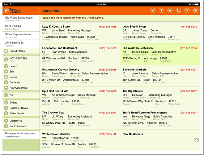
The list of customers shown below is much easier to read. The right-hand side of the screen is occupied by a docked sidebar with context actions. Actions “Edit”, “Delete” and “Search” are also duplicated on the toolbar as icons.

Mobile app created with Code On Time displayed in portrait orientation on Apple iPad Air.

Change the device orientation to landscape and observe a two-column list of items. The default mode of “list” presentation in Code On Time mobile apps is called “Cards”. List items are rendered as “cards” as soon as a sufficient screen width is detected.

Mobile app created with Code On Time displayed with docked sidebar in landscape orientation on Apple iPad Air.

If the sidebar is undocked, then a two-column list of cards is displayed in portrait mode as well.

Mobile app created with Code On Time displayed with undocked sidebar in portrait orientation on Apple iPad Air.

Landscape-oriented iPad Air displays three columns of cards when the sidebar is undocked. Numerous action shortcuts are now visible on the toolbar of the mobile app.

Mobile app created with Code On Time displayed with undocked sidebar in landscape orientation on Apple iPad Air.

Users can also enable a “list” mode as an alternative to “cards”.  The following screenshot shows an open context menu with the “List” presentation style selected. The list of customers features labels next to each component of the address (Address, City, Region, etc.).

Mobile app created with Code On Time displayed with undocked sidebar in 'List' mode with portrait orientation on Apple iPad Air.

The form view in this screen shot shows customer data fields with available actions conveniently displayed in the docked sidebar.

Form view of a mobile app created with Code On Time displayed with docked sidebar in portrait orientation on Apple iPad Air.

Undocking of the sidebar will cause some of the available actions to render as actions buttons.

Form view of a mobile app created with Code On Time displayed with undocked sidebar replaced by action buttons in portrait orientation on Apple iPad Air.

Nexus 7

Users of a smaller tablet will also enjoy the benefits of addition screen real state. List of customers displays actions “Edit”, “Delete”, and “Search” next to the “Context Menu” on the toolbar. Data fields are clearly visible in portrait mode.

Mobile app created with Code On Time displayed in portrait orientation on Google Nexus 7.

A sidebar with context actions is displayed in the portrait mode of Nexus 7 tablet.

Mobile app created with Code On Time displayed with docked sidebar in landscape orientation on Google Nexus 7.

Undocking of a sidebar will cause a two-column display of list item “cards” with additional buttons on the toolbar of the mobile app.

Mobile app created with Code On Time displayed with undocked sidebar and two-column list of 'cards' in landscape orientation on Google Nexus 7.

Landscape orientation of a tablet with docked sidebar allows easy access to context actions when editing data in a form view.

Form view of a mobile app created with Code On Time displayed with docked sidebar in landscape orientation on Google Nexus 7.

Context actions are instantly exposed as action buttons when orientation of the mobile device is changed to portrait.

Form view of a mobile app created with Code On Time displayed with action buttons in portrait orientation on Google Nexus 7.

Other Devices

Exactly the same fluid and responsive web design is demonstrated on other types of devices. You can see the app rendered in a desktop version of Internet Explorer 10.

Mobile app created with Code On Time displayed in a desktop version of IE 10.

Code On Time turns development of line-of-business mobile applications in a fast assembly line while offering the same “mobile” style presentation on desktop devices as well. Only one version of the app must be developed while covering a wide range of mobile and desktop devices.

Applications produced with Unlimited edition of the app generator will also feature a dedicated version of the desktop presentation style that may benefit some groups of users as well.

If you are building a mobile app then a “desktop” version of it has already been created. The opposite is also true.

Universal Mobile/Desktop Client of an app created with Code On Time displayed with 'desktop' presentation style in IE 10.

User Guide for Mobile Lists

$
0
0

List is a common presentation style of data on mobile devices. Limited screen size calls for a stacked enumeration of data fields. Some fields may be provided with descriptive labels.

A list view in a mobile app created with Code On Time mobile app generator.

Applications produced with Code On Time have a responsive user interface design. Predefined and dynamic breakpoints will ensure that a list displays more fields with optional labels on a larger screen whenever possible. A simple change of a mobile device orientation will reveal additional information in list items.

 A list view on a mobile device with landscape orientation reveals addtional item details in a an app created with Code On Time mobile app generator.

Scrolling Items

User can scroll down to see items that are not visible on screen. Only a limited set of available data items is included in the initial rendering of a list. A special item labeled “Loading…” will become visible for a brief moment upon reaching the bottom of a list. Application detects that a user has reached the last visible list item and loads additional set of items from the server if they exist.

A list of items is about to be extened at the bottom in a mobile app created with Code On Time mobile app generator.   Additonal items were automatically loaded in a list after reaching the bottom of the initial data set in a mobile app created with Code On Time mobile app generator.

If a data item is edited or inserted by a user, then the application will retrieve a set of items containing the change.  That item will be displayed with an alternative background to indicated that it has been selected.

It is possible that the set of items with the selection is located somewhere in the middle of the entire data set. Scrolling up will reveal “Loading…” item at the top of the list in this case. Additional  items will become available shortly after an automatic interaction with the server.

A list is about to retreive additional items at the top in the mobile app created with Code On Time mobile app generator.   A list after additional items were loaded at the top in the app created with Code On Time mobile app generator.

Selecting an Item

There are two main methods of selecting an item in a list. The user can either tap an item or tap and hold an item for brief period of time. A tap on an item will cause an-application defined action to execute. Typically another view of data is displayed in response.

A tap on a list item will activate an application-defined action in a mobile-app created with Code On Time mobile app generator.   A form view of data item is displayed in response to an item tap in a mobile created with Code On Time mobile app generator.

Tapping and holding an item for three quarters of a second will cause an item to be selected but no action will be executed. This will result in item-specific actions to become available in the user interface of the list.

For example, the list without a selection offers “New” and “Search” actions on the  toolbar of a mobile app just before an item is tapped by a user. The tapped item will be illuminated for a moment with a highlighted background.

Actions 'Search' and 'New' are visible on the mobile application toolbar just before an item is tapped in the app created with Code On Time mobile app generator.

Selection of an item with “tap and hold” will cause “Edit”, “Delete”, and “Search” actions to show up. The selected item will have an alternative background.

Actions 'Edit', 'Delete', and 'Search' are available on application toolbar of a mobile app created with Code On Time mobile app generator.

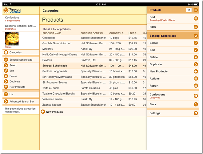
Additional actions and presentation options can be accessed from the context menu of a list. The context menu will slide out after a user taps on the “Context Menu” button on the application toolbar.

Context menu is always available on the application toolbar of a mobile app created with Code On Time mobile app generator.   Context menu slides out in response to a tap on the 'Context Menu' button on the application toolbar of a mobile app created with Code On Time mobile app generator.

View Configuration

The first item in the context menu shows the name of the view and the total number of items available. Tap this item to display the view configuration options.

'View Configuration' menu option displays the name of the current view and number of items in a list displayed by a mobile app created with Code On Time mobile application generator.

A list may have a few application-defined alternative views of data with custom fields, sort order, and filter. Tap an alternative view of data to have it activated.

The list of available view configuration options in a mobile app created with Code On Time mobile application generator.   Alternative view option selected in the view configuration menu of a mobile app created with Code On Time mobile application generator.

The list will display the selected view of data.

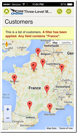
An alternative view of customer list displayed in a mobile application created with Code On Time mobile/desktop app generator.

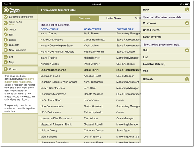
Presentation styles “List” and “Cards” are available in the view configuration of any list. The default presentation style of a list is “Cards”. This presentation style allows a list to be displayed in multiple columns if the screen size of a mobile device makes it possible.

The default presentation style 'Cards' displays three columns of items in a list of a mobile app when displayed in iPad Air. The application has been created with Code On Time mobile app generator.

Presentation style “List” will force the list to be displayed in a single column regardless of the screen resolution. This will result in more details to be visible in each item of a list on a larger screen.

Presentation style 'List' will force a list to display a single column of items regardless of the screen resolution of a mobile device. This presentation style is shown in a list of a mobile app created with Code On Time mobile app generator.

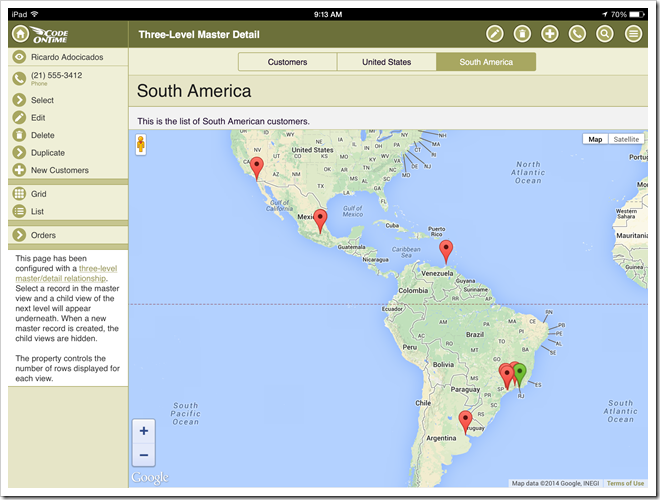
Note that additional presentation styles of data such as “Grid”, “Chart”, “Map”, and “Calendar” may be visible in the view configuration options as defined by application.

The selection of alternative view or presentation style will be “memorized” on the mobile device and remain specific to the user identity and list instance on the application page.

User can refresh the list items by choosing “Refresh” option in the view configuration menu. Any changes to the list data by other users will become visible on the mobile device.

'Refresh' option selected in the configuration menu of a list in a mobile app created with Code On Time mobile app generator.

Adding an Item

If a user swipes to the end of a list, then an additional item that allows executing “New” action is displayed at the bottom. This action is application-defined and may not be accessible to all users.

User can tap on the item to start entering a new data record.

An option to create a new item is displayed at the bottom of a list in a mobile app created with Code On Time mobile application generator.   User can start entering a new item by tapping on the option at the bottom of a list in a mobile app created with Code On Time mobile/desktop app generator.

Empty Lists

An empty list may be displayed to a user if the database table is empty or if the current list filter has produced no matches. Action shortcut “Refresh” and optional shortcut “New” will be displayed in the list.

Options to refresh a list and to create a new item are displayed in an empty list of a mobile app created with Code On Time mobile app generator.

List Heading

A list may display a heading item with a brief description of the list contents. If a list is scrolled down, then the heading will “stick” to the toolbar.

An optional list description is displayed before the first list item in a mobile app created with Code On Time mobile app generator.   A list description with a fixed position at the top of the toolbar is displayed when a list is scrolled in a mobile app created with Code On Time mobile app generator.

User can tap on the heading to dismiss it.

User Guide for Mobile Forms

$
0
0

Mobile apps created with Code On Time will display a form view in response to many user actions. A form will present data for a single database table record as a list of fields.

Navigating in a Form

Here is an example of a form displayed in response to a tap on an item in a list of products.

Tap on an item in a list will transition to a form view in a mobile app created with Code On Time mobile app generator.  A form view with portrait orientation displayed by iPhone 5s in a mobile app created with Code On Time mobile app generator.

A field label is displayed above the field value on devices with smaller screens. If orientation of a mobile device is changed, then a label will be displayed on the left side of the field value.

A form view of a mobile created with Code On Time mobile/desktop application generator is presented in landscape orientation.

Note that a change in orientation will also reveal additional user interface elements. Actions “Edit”, “Delete” and “New” are visible on the application toolbar in the top right corner of the screen.  Action “Edit” is the only available choice available on the mobile phone with a portrait orientation. Mobile apps created with Code On Time have a responsive design that ensures optimal viewing on a device with any screen size.

If a field label is too long, then it may become partially hidden. Tap and hold a field label for three quarters of a second to see a hint with the full label text.

Tap and hold a label in a form view for about a second to see the full text in a popup in mobile apps created with Code On Time mobile app generator.

Fields of a form are grouped in one or more categories defined by the application. Tap a category to collapse a list of fields. Tap the same category again to have it expanded.

Tap a field category in a form view to have it collapsed in mobile apps created with Code On Time mobile app generator.   A collapsed field category in a form of a mobile app created with Code On Time mobile app generator.

An item card with a summary of a data record will be displayed at the bottom of a form view when on a master-detail page. Links to related detail lists are displayed below the card.

Tap a link under the card and the form will transition to a list with corresponding items.

A summary card with links to details of the selected master record is dislayed in master-detail pages of mobile apps created with Code On Time mobile app generator.   Tap on the detail link below the summary card to see a list of details in a mobile created with Code On Time mobile database app generator.

Actions in Forms

The context menu provides access to all actions available in a form view. Tap the context menu icon on the right side of the toolbar to see the menu of actions.

Tap a context menu button on the toolbar to see a complete list of actions available in a mobile app created with Code On Time mobile database app generator.   A context menu panel with a list of actions available in a form view on a mobile app created with Code On Time mobile/desktop application generator.

A context menu sidebar will be docked to the right side of mobile devices with a larger screen. Context menu button is not visible if the sidebar is docked.

Form view actions listed in the docked sidebar on iPad Air in a mobile app created with Code On Time mobile/desktop app generator.

A subset of available actions is presented on the application toolbar as icons. The number of visible icons depends on the screen size.

Tap an icon to activate the corresponding action.

Tap a toolbar icon to activate a corresponding action available in a form view of an app created with Code On Time mobile app generator.

Form view may also display action buttons at the top and bottom of the view if the sidebar is undocked. The number of visible action buttons depends on the screen size. Tapping on a button will execute an action, which may result in a different set of buttons becoming available.

Editing of a data record in a form is activated when 'Edit' button is tapped in a mobile app created with Code On Time database mobile app generator.   A form view is displayed in edit mode in response to 'Edit' action in a mobile app created with Code On Time mobile database app generator.

Entering Data in Forms

Application form view will display input controls in response to “Edit” and “New” actions. Ability to create or edit data is controlled by the application and may not be available to all users.

Tap and hold a field value in a form view to quickly execute “Edit” action. The form will switch to “Edit” mode in response to tap and hold.  The form will set a focus on the field input control if you continue holding a finger on the screen of your mobile device.

Tap and hold a field value in the form view to activate 'Edit' mode in a mobile apps created with Code On Time mobile app generator.  Extended 'tap and hold' on a field value will set focus on the field input control in a mobile app created with Code On Time mobile database app generator.

Form view will activate a standard text input keyboard on mobile devices when a text field is focused.

A numeric native keyboard is activated if the field has a numeric data type.

A numeric keyboard is displayed when a numeric field is focused in a form view of a mobile app created with Code On Time mobile app generator.

Fields configured to capture phone numbers will also have a dedicated input keyboard.

A 'phone number' keyboard is displayed when a 'phone' field is focused in a form view of a mobile app created with Code On Time mobile app generator.

Specialized native keyboards will also display if the focused text field is configured as URL or Email.

Lookup fields with lists of values will be displayed as native input controls.

A native 'select' input control is displayed for lookup fields with lists of values in mobile apps created with Code On Time mobile database app generator.

Focused date fields will cause a native date input control to display. The type of control depends on the operating system of a mobile device.

Date input control on iPhone 5 is shown next.

A native date input control of iOS 7 is shown in a form view of a mobile app created with Code On Time application generator.

Date input control on Nexus 7 is shown in this screenshot.

A native Android date input control is visible in a form view of a mobile app created with Code On Time mobile database app generator.

A specialized native date-time input control is displayed for fields that  allow capturing both date and time.

Database applications frequently require complex search criteria when selecting lookup values. It is possible that lookup tables contain many thousands of possible choices. Code On Time mobile apps are automatically configured to display a custom lookup input control for database lookup fields.

A lookup input control is shown before and after a tap on the field value.

A database lookup input is displayed in a form view of a mobile app created with Code On Time mobile app generator.   A list of lookup values with support for endless scrolling, search, filtering, and sorting is displayed in a mobile app created with Code On Time mobile database application generator.

A list of lookup values behaves in exactly the same fashion as standalone lists with support for endless scrolling, search, filtering,  and sorting. Existing lookup items can be modified and new ones can be created if allowed by application business logic.

Advanced Form View Features

Application may define a status bar explaining a workflow status of a data item selected in a form view. The status bar is displayed at the top of the form. The contents of the status bar can be scrolled with horizontal swiping motions.

Status bars help users to understand the workflow status of items selected in a form view in mobile apps created with Code On Time mobile/desktop application generator.

Fields of complex forms are frequently organized in multiple categories. Categories can be independently collapsed and expanded. The screenshot shows a form with multiple categories displayed in iPad Air.

Collapsible field categories makes easier to work with large number of fields in mobile apps created with Code On Time mobile app generator.

Categories can be further organized with tabs. Tabs are displayed at the bottom of a form view. This screenshot shows a tabbed form with multiple categories displayed in Nexus 7 tablet.

A form view with multiple categories and tabs in a mobile app created with Code On Time app generator.

If a form view is scrolled down, then a heading with the value of an identifiable data field may be displayed below the toolbar. This will happen if an identifiable field is not visible on the screen. The identifiable field is displayed as the first data element in lists.

A heading with the value of identifiable field is dispalyed when a user scrolls down a form view in mobile apps created with Code OnTime mobile app generator.

The heading will disappear if a user starts editing data or scrolls the identifiable field back into view. Tap on the heading to have it hidden.

Mobile Database Apps With Responsive Design

$
0
0

Code On Time is pleased to announce immediate availability of a significant revision of the Mobile Client in applications created with Code On Time database application generator. It allows creating mobile database apps with responsive design.

See the latest demo of the mobile client at http://demo.codeontime.com

Release 8.0.3.0 includes the following features and enhancements that cover mobile and desktop functionality:

  • Mobile client enables applications with a sophisticated responsive design.
     
  • Mobile client supports advanced formatting and presentation of lists and forms. Tutorials explaining data field tags used for list formatting are coming out this week.
     
  • Mobile client supports multi-field copy and performs processing of context fields.
     
  • Mobile client supports dedicated login pages. We recommend generated a brand new app with a dedicated login page and copying the “mobile” contents of the Login.ascx markup to your existing dedicated page. The tutorial covering dedicated login will be out this week.
     
  • Mobile client supports confirmation controllers. Try it out here.
     
  • Mobile client works correctly with default values assigned with RowBuilder methods and SQL and Code business rules.
     
  • Mobile client supports native input for date, date-time, numbers, URLs, email, and phone.
     
  • Mobile client scopes page-specific user settings by application and user name.
     
  • Switch "_mobile=true" and "_mobile=false" in the URL will refresh the page after switching mobile/desktop client on desktop devices instead of redirecting to the application home page.
     
  • App generator puts project name in the page header if a header is not provided.
     
  • App generator records project name and type in the root element of DataAquarium.Project.xml.
     
  • Desktop client will correctly display line breaks in fields with Text Mode = "Notes" when rendered in modern browsers.
     
  • Idle user detection configuration will affect the forms authentication timeout in web.config of a generated app by making it five minutes longer than the idle user timeout.
     
  • Unauthorized exception raised when user looses identity due to timeout is enhanced with recommendation to enable idle user detection. The exception will remain in place to prevent unauthorized requests to data controllers.
     
  • Idle status of a user is now checked every minute instead of every 3 minutes.
     
  • Desktop client will not fail when a modal form is closing and control is passed to a grid view with "asc" or "desc" in multi-field sort expressions.

We expect that the release at the end of February 2014 will include mobile support for most of the following features:

  • Blob upload/download
  • Calculated fields
  • Conditional visibility of categories and fields
  • Conditional read-only fields
  • Filtering capabilities
  • Mobile advanced search bar
  • “Check Box List” lookup style for many-to-many fields with “basket” functionality
  • Dedicated presentation for Auto Complete, Check Box lookup styles.
  • Multiple selection of list items
  • Tabular display of list items

We are preparing a mobile version of Order Form sample.

The Roadmap 2014 will be published shortly with details about http://cloudontime.com.

Roadmap 2014

$
0
0

Applications created with Code On Time are equipped with a Universal Mobile/Desktop Client.  Application pages are rendered with a device-friendly user interface. Mobile smartphones and tablets display touch-enabled pages with lists and forms featuring a responsive design.

Multi-purpose pages behave as standalone units of a line-of-business application. This concept is known today as a Single Page Application. The concept is rapidly catching on with the mainstream development community. It has been an integral part of apps created with Code On Time for the past five years.

The power and flexibility of the Code On Time application framework is proven by the mere fact of its ability to work with two completely different client libraries. The same exact “Code”, “SQL”, “Email”, and “JavaScript” business rules and exactly the same pages work with both mobile and desktop client devices.

This year we will introduce amazing new forward-looking framework capabilities and a new product called http://cloudontime.com.

Mobile Client

Mobile Client is based on the leading mobile JavaScript framework jQuery Mobile 1.4, released in December of 2013. We have deliberated a lot while trying to pick the best mobile framework as the foundation of the mobile client and settled on JQM. Primary reasons are the extensive support of numerous mobile operating systems, huge following, and tight integration with jQuery.

The initial release of Mobile Client does not fully match its desktop counterpart when it comes to a few features such as advanced search, filtering, dynamic calculations of field values, and conditional visibility. The gap will be closed by the end of March 2014.

Presently, the mobile client supports a single default theme. We will offer a large number of alternative themes and provide customization instructions in the coming  months. Theme Roller for jQuery Mobile will be used to create the themes.

Our next goal for the Mobile Client is to provide Grid, Data Sheet, Hierarchy, Map, Calendar, and Chart views.

  • Grid view will offer a “table” style responsive presentation of mobile lists. The number of visible columns will change depending on the screen size and device orientation.
  • Data Sheet view is the production release of the 2nd generation data sheet that was first introduced in the desktop client. It will support inline editing of field values with a new touch-enabled scrolling mechanism.
  • Hierarchy will be a feature of List, Grid, and Data Sheet views. The configuration of hierarchies is explained here.
  • Map view will be based on Google Maps integrated with JQM.
  • Calendar view is a touch-enabled custom implementation of a typical calendar. We will be borrowing presentation ideas from the leading mobile operating systems.
  • Chart view will be an extension of current charting capabilities of the desktop client.

Release 8.0.3.0 features a Task Assistant displayed when users tap on the toolbar header text. Unlimited edition applications will also show History and Favorites tabs with lists of data cards representing master data records to facilitate business-related activities.

We are also working a on a few data input enhancements:

  • “Basket” lookup style will complement “Check Box List” to enable multiple selection from a large number of options. This style of presentation will automatically activate if a list of “many-to-many” options is greater than a predefined number when rendered on mobile devices to improve presentation. “Basket” lookup will be available in Desktop Client after the initial introduction in the Mobile Client.
  • Signature capturing will complement Blob adapters. Users will be able to draw a signature on touch-enabled screens. The signature will be stored as a high-resolution PNG image with an optional SVG version. This is a high-priority feature that will be first introduced in the Mobile Client.

Mobile Client on the Desktop

Universal Mobile/Desktop Client uses two different JavaScript libraries to render the user interface. The mobile client library is touch-enabled and works great with a mouse as well. You can see a mobile user interface demo in action on your desktop computer.

The current market trend in the desktop computing is the introduction of touch-enabled screens. Microsoft Windows 8 is touch-enabled. Most business users will end up having a touch-enabled computer in the near future.

The major difference between mobile and desktop presentation in a Code On Time app is the number of data views visible to a user at any moment:

  • Desktop Client presents multi-level master-detail pages that allow a user to gain immediate access to data views on any level by scrolling the page up and down.
  • Mobile Client displays only one data view of a multi-level master-detail page. User clicks on navigation buttons to access relevant data views from lower levels.  The drill-down approach is common in mobile operating systems. There is always a way to return back to the original top-level data views of a page.

Our development team is researching the possibility of creating multi-pane presentation with data views displayed each in its own pane on desktop devices. Additional panes will be revealed on the same screen when a user drills down to see related “detail” data.  The responsive design of the mobile client scales perfectly for a multi-pane presentation. Panes will be independently scrollable.

MultiPaneMobileSample2

We will introduce the multi-pane capability in the mobile client in the near future.

Based on your input we will consider if this will be a good approach to follow when building touch-enabled line-of-business applications for both mobile and desktop devices. What do you think?

Offline Data Caching

Performance of line-of-business applications in HTML 5 web browsers can be greatly improved with client-side data caching. We will introduce ability to cache entire datasets exposed by data controller views on the client.

Data controller view will have a Tag property to control client-side caching. For example, tagging a data view as data-cache37 will cause the client library to look for data in the local storage of the browser before attempting to request data from the server. If the data is in the storage and it has been there less than 37 minutes, then the client library will not attempt to access the server and will use the cached data instead.

Tagging of a view for client-side caching will disable advanced search and will only leave Quick Find and Adaptive Filtering search options. Both operations will be performed via JavaScript entirely on the client.

Cached data will be scoped to the user identity and page. We will make sure that cascading lookups work correctly with cached data.

This unique capability will be available in both Mobile and Desktop client.

Offline Transactions

The current implementation of client library does not cache data changes in the browser. If a transactional data input is required, then we generally recommend to rely on your database server and follow transaction implementation strategies that include “Status” field, log tables, or staging tables. The described strategies will work perfectly well with mobile and desktop devices.

If a network connection is lost or unavailable, then the server-side transaction processing is not going to work.

Modern web browsers can notify a web page if a network connectivity is lost and when the client device is back online.

New tag data-offline will allow indicating that the page data views are supporting offline transactions. The tag will activate automatic caching of data requests to Update, Insert, and Delete data. Client library will store each AJAX request object in the local browser storage in the sequence the requests are initiated, without sending request to the server. The client library will execute “cached” requests locally to simulate the end result of Update, Insert, and Delete actions on the client. Developers will be able to implement custom JavaScript business rules in offline mode.

Two new actions “Commit” and “Rollback” will be supported. Actions will be visible in their scope only if there are pending “offline” changes. If a network connection is available, then “Commit” action will send all pending requests as a single array to the server for execution. The server will perform all request in the same sequence that was recorded on the client to allow the database server to persist changes. Simulated client-side data modifications will be discarded if all operations were successfully executed. “Rollback” will simply remove pending changes and restore client-side data to its initial state.

The primary objective of this feature is to allow implementing apps that can capture data without a mandatory interaction with the server. Signature capturing will also work in this mode.

Offline Mobile Client

HTML 5 standard defines a concept of an application manifest that helps a web browser to download all application resources such as HTML pages, JavaScript files, images, and CSS style sheets. Resources listed in a manifest are cached in the local browser storage. A manifest can also include resources that represent application data as static JavaScript structures.

We will implement a dynamic HTML 5 application manifest construction in Code On Time apps created with Unlimited edition. Only pages and data marked to work Offline will be included.

End users will be able to download the offline version of an app by simply entering the application web address followed by “offline” path. For example:

http://myapp.com/offline

The contents of the manifest will be downloaded when the app is accessed for the first time from an HTML 5 browser. This is basically a process of application installation.

The subsequent visits will follow this script:

  • If a network connection is available, then a browser will ensure that the contents of the manifest and previously downloaded resources are up-to-date.
  • If a network connection is not available, then verification of resources is skipped.
  • The browser will proceed to display pages from the local storage.
  • The client library will always check “local” resources before attempting to download data from the “network”.

Note that the offline app is not a separate application. It is is simply a capability of an app created with Code On Time to expose some of its functionality to offline users.

Offline apps will be provided with the Mobile Client user interface

Offline apps do not require distribution through the app stores of mobile operating systems.

Native Mobile Apps

Modern mobile development has a popular trend of building native apps with JavaScript and HTML, packaged to run in embedded web browsers of a mobile operating system. There are several popular tools that allow packaging a collection of HTML and JavaScript files as a native app.

The app generator will support production of pre-packaged files for at least one of such tools that will be announced in the second half of this year.

Native apps will have to be distributed through an app store of the chosen mobile operating platform.

Next Generation Desktop Client

Current implementation of Desktop Client works best on high resolution screens with the mouse and keyboard.

The next generation of the desktop client will be based on the mobile client and will feature a slide-down ribbon with context actions and menu options at the top of each page. Multi-pane pages on the desktop client will display containers arranged in multiple columns and rows, which will turn a page into a collection of scrollable tiles.

The new version of desktop client will ensure efficient desktop keyboard data entry in the forms and data sheet view.

We will likely offer additional presentation enhancements to various view styles that will benefit desktop users.

Mobile user interface themes will be adapted for improved desktop  presentation.

The details will become available in second half of 2014.

EASE (Enterprise Application Services Engine)

For the past few years we were building a collection of features under a moniker EASE (Enterprise Application Services Engine). Several key features have not been released to production as a part of Code On Time application framework. The key unreleased components are Workflow Register and Dynamic Access Control List. The initial implementations were complex and difficult to manage.

The latest iteration has been significantly streamlined.

DACL (Dynamic Access Control List) will not be a dedicated module in the generated apps as originally intended. Instead we have re-factored this into Workflow Register.

Workflow Register is based on a core set of 11 tables that will have to be hosted in the application database. There will be a set of built-in data controllers similar to Membership Manager that will allow managing configuration data in the tables. 

Workflow Register allows associating "Workflows" with Users and User Groups controlled by optional schedules.

"Workflow" is a combination of Rules.

Rules are matched to registered objects. Objects represent "business entities" of your app.

A rule may define:

  1. SQL expression limiting access to data (Dynamic Access Control Rules)
  2. Custom version of a data controller
  3. Transformation of a data controller via Node Sets (Data Controller Virtualization)
  4. Transformation of a data controller via XSLT (new feature)
  5. Custom version of a page content (new feature)
  6. Transformation of XHTML content (page) via XSLT (new feature - virtualization of pages)
  7. Custom page URL for Search Engine Optimization

Application framework automatically "consults" rules of workflows matched to the current user when performing various life-cycle operations on controllers, pages, and data.

Installation of Workflow Register will include built-in business entities.  Built-in entities include:

1) blog
2) content
3) image
4) comment
5) support ticket
6) discussion

The described entities are there to support built-in Atom-based publishing module of the Content Management System of the application framework. This is a new feature of EASE.

Installation of Workflow Register in the database will allow building a dynamic website similar to http://codeontime.com with built-in blogging, community forum, and ticket-based support system. All these features will run alongside your own data controllers if enabled.

There will be built-in rules to control access to blogs, content, images, comments, support tickets, and discussions. Workflow Register will allow browsing and changing these rules. We expect the built-in rules to be a "live" example of Dynamic Access Rules that developers can use to model restrictions for their own data.

New EASE features will be integrated in the application framework in April/May of 2014.

Cloud On Time

The new product called http://cloudontime.com will go online in April of 2014. 

This product is an app created with Code On Time. The type of the project is Azure Factory.

Cloud On Time allows creating custom cloud apps on top of dedicated databases hosted in Windows Azure. The apps include Universal Mobile/Desktop Client and all EASE features.

Users will be able to create “cloud” tables using a browser on mobile and desktop devices. A built-in Designer works in the cloud and is modeled after Project Designer available in Code On Time app generator. Multi-user development teams will be able to cooperatively work on their projects.

Developers will customize projects with SQL, JavaScript, and Email business rules.

Monthly subscriptions with several levels and a free trial period will be available.

Subscribers can use a free standalone utility to download their entire cloud database from Cloud On Time to a local machine in a variety of formats.

The same utility will allow uploading an existing database to Cloud On Time.

The target  audience of the product:

  • Business users who want to rapidly prototype a mobile or desktop line-of-business application without using developers.
  • Professional development teams can quickly build complete apps hosted in a private database running in a shared cloud.
  • Code On Time app generator users can prototype an app in a cloud and bring it locally for further development and deployment to their own platform of choice.

Touch UI, Firebird Database, Azure SDK 2.3

$
0
0

Code On Time release 8.0.4.0 introduces a new user interface concept Touch UI and support for Firebird Database Server.

Touch UI (former Mobile Client) is the next generation of the client library. Mobile Client has been introduced in December of 2013. The main objective was to offer a close-to-native mobile experience when using web applications created with Code On Time. We have come to realize that intuitive navigation and new presentation style can benefit greatly users working with desktop computers. During the past two months we have reworked the Mobile Client and turned into a universal touch-enabled presentation system.

The purpose of the new UI is to enable development of a single app that displays equally well on end-user devices of any type. The new enterprise computing concept BYOD (bring your own device) becomes a reality with Code On Time. If you are building an app with Code On Time, then you have already accommodated users of smart phones, tablets, and desktop computers.

Try an app with Touch UI right now!

An app with Touch UI displayed in iPad Air. The app has been created with Code On Time app generator.

An app with Touch UI is displayed in iPhone 5s. The app has been created with Code On Time app builder.

An app with Touch UI is displayed in IE 11. The app has been produced with Code On Time generator.

Touch UI uses the same code base and the same set of business rules. If you are a building a line-of-business app for desktop users then you have already created a mobile version of it. If you are only looking forward and trying to please your mobile user base, then you are also offering a first class experience on the desktop (even if you don’t want to).

Firebird database server is now supported by Code On Time app generator. This is another highlight of the release. Download Firebird and build powerful line-of-business applications with a lightweight database server.

The following enhancements are also included in the release:

  • Touch UI is based on jQuery Mobile 1.4.2.
     
  • Client library provides an enhanced progress indicator.
     
  • Mandatory input fields display “Required” watermark if a custom watermark is not provided.
     
  • Batch Update commands correctly work with modal forms in Desktop UI.
     
  • Azure SDK 2.3 support is integrated in the app generator.
     
  • App generator uses “All CPU” parameter when building projects with MSBuild.
     
  • URL Hashing allows _mobile switch in the browser address bar to enable testing Touch UI on desktop computers.
     
  • Method ControllerNodeSet.CreateBusinessRuleFilter correctly works with data controller virtualization rules.
     
  • Tools for Excel recognizes Watermark property of data fields.

What’s Next?

Touch UI is not completely replacing the current desktop presentation. We will continue supporting desktop and will enhance the client library with further improvements in SharePoint Factory and DotNetNuke Factory.

The desktop presentation in the other project types will eventually become a secondary “fall-back” option for browsers that do not support HTML 5. We will introduce built-in CMS (Content Management System) in the code base of these project types. This may become an attractive alternative to SharePoint and DNN if your application requires custom user-generated dynamic content.

Touch UI is the user interface of the upcoming http://cloudontime.com hosted service.

See the list of upcoming features that we are working on in the Roadmap 2014.

Full Screen Mobile Web Apps with Native Performance

$
0
0

Web Apps created with Code On Time have a fluid, native-like performance on both desktop and mobile devices. Mobile end users are accessing web apps through a web browser integrated into operating system of their device. Modern mobile browsers allow adding a web app shortcut to home screen of the device. If a web app is started from home screen, then the browser will hide the address bar and navigation controls taking advantage of the entire real estate of the screen.

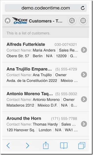
Compare the screen shots of a web app created with Code On Time displayed on iPhone 5. Both screen shots show exactly the same web app. The former was started from the home screen of the phone. The latter was started directly in mobile Safari. Web app “installed” to home screen clearly provides access to more information and has a “native” look and feel. A thin black bar at the top of the screen provides a user with vital device status information when interacting with “installed” web app.

Full screen web app created with Code On Time on iPhone 5.  Web app created with Code On Time displayed in Safari web browser on iPhone 5.

The same benefits are obvious if device orientation is changed to landscape.

Full screen web app created with Code On Time on iPhone 5 with landscape orientation.

Web app created with Code On Time displayed in Safari web browser on iPhone 5 with landscape orientation.

It is very easy to install a web app to home screen of a mobile operating system.

Consider the process of installing a web app created with Code On Time on iPad Air.

First, open mobile Safari and navigate to http://demo.codeontime.com.

Tap “Share” button and select “Add to Home Screen” option in the popup window.

Select 'Share|Add to Home Screen' option to add web app created with Code On Time to home screen of iOS device.

Change the name of the link as needed and tap “Add”.

Adjust the icon title and web address of Web App created with Code On Time when installing a home screen shotcut on iOS device such as iPad Air.

An icon with a chosen title will be added to the home screen. This concludes the installation process.

A shortcut icon for a mobile app created with Code On Time on iPad Air home screen.

Note that it is easy to provide a custom application icon and logo for a web app created with Code On Time.

Start your web app to enjoy the full screen experience on iPad Air.

A web app created with Code On Time is displayed full screen on iPad Air.

Here is the installation process for Google Nexus 7.

Enter the address of the web app created with Code On Time and tap “menu” button on the browser toolbar. Select “Add to homescreen” option, change the title as necessary, and tap “Add” .

Context menu in Google Chome provides access to 'Add to homescreen' option on Android devices.Changing the icon title of a web app created with Code On Time when added the app to the homescreen of Android device.

The web app is now installed.

Tap the icon to access the web app created with Code On Time for a full screen experience.

Tap the icon to access the web app for a full screen experience.

Web app with Touch UI on Google Nexus 7 displayed in full screen mode when started from the homescreen.

Web apps created with Code On Time allow changing various settings such as theme and page transition effects. Note that those settings will not be inherited by installed app. Web apps added to home screen maintain their own settings on the device.

Configuring a Custom Logo in Touch UI Apps

$
0
0

A web app with Touch UI displays a small logo on the left side of the tool bar next to the Home button. The logo is also displayed in the same spot on tablets and desktop devices.The color of the logo depends on the user interface theme. A separate “icon” logo is displayed by mobile devices on the home screen if a web app has been installed to run in a full screen mode.

The screenshot shows a standard colorful logo of a web app displayed on full screen of iPod Touch.

A standard logo is displayed on the left side of the tool bar next to the Home button in web apps with Touch UI.

Next screenshot shows a black logo in a web app displayed on full screen of iPad Air.

A standard logo is displayed on the left side of the tool bar next to the Home button in web apps with Touch UI on iPad Air.

This screenshot shows an application with Touch UI on a desktop computer. The logo is white.

A standard logo is displayed on the left side of the tool bar next to the Home button in web apps with Touch UI in a desktop browser.

This is an icon of installed web app as displayed by iPad Air.

A standard shortcut icon of web app with Touch UI on iPad Air.

The standard logo files can be found in the ~/touch folder of Web Site Factory and Mobile Factory applications.

The same files are found in ~/WebApp/touch folder of Web App Factory projects.

Azure Factory applications keep the logo files in ~/WebRole1/touch folder.

The standard logo files in a Mobile Factory web app with Touch UI created by Code On time app generator.

Replace the files with your own images for a customized look.

Create logo-black.png, logo-color.png, and logo-white.png images with the size 120 x 54 and copy them over the standard files to replace the logo on the toolbar.

Create logo-icon.png with the size 196 x 196 and replace the corresponding file for a custom application icon.

Here is an example of a custom logo that we are using to modify the standard toolbar images. Our file has a transparent background. We have used exactly the same image for all three logos displayed on the toolbar.

An example of a custom application logo for a web app with Touch UI created by Code On Time app generator.

This is how the new logo looks in a live application.

An example of a custom application logo in a live web app with Touch UI created by Code On Time app generator.

If the the standard size of the logo is tool small, then consider creating a custom CSS stylesheet in the ~/touch folder and placing a CSS rule that will replace the standard positioning and sizing of the logo.

Custom file StyleSheet.css is placed in the touch folder of a Mobile Factory app in this screen shot.

Custom stylesheet placed in the 'touch' folder of Mobile Factory project.

This is the rule that changes the position of the background and its size. We recommend experimenting with actual values to accomplish the best fit for you needs.

@media (min-width: 20em) {
    .ui-header.ui-header-fixed:not(.app-tabs) {
background-position:1.75em 0;
        background-size:100px;
    }
}

The logo in the next screen shot takes the entire height of the toolbar.

An example of an enlarged custom application logo in a live web app with Touch UI created by Code On Time app generator.

The larger file logo-icon.png provides a custom application icon on a home screen of iOS device.

Custom shortcut icon in a full screen web app with Touch UI created by Code On Time line-of-business app generator.

Full Screen Mobile Apps, Responsive Grid, etc.

$
0
0

Code On Time release 8.0.5.0 introduces numerous enhancements in Touch UI that brings closer our goal of delivering a new generation of a responsive user interface that works great on both mobile and desktop devices. Your line-of-business web apps will look great, now with an option to display a full screen presentation on mobile devices delivering close-to-native performance.

A web app displayed in full screen mode on iPad Air. The app has been created with Code On Time app generator.

A responsive grid view is now also available providing a responsive “table” presentation of data on any device. Application intelligently hides and reveals grid columns depending on the available screen width. Developers control the logic of field selection by configuring the list presentation of data.

A repsonsive grid in a web app with Touch UI shows a context menu of actions that can be applied to the selected row and entire data set. Application has been created with Code On Time app generator.

End users can switch between grid and list presentation by selecting a corresponding option on the sidebar on in the “view menu” item. Open the context menu of grid or list view to select “view menu” item when sidebar is not visible. It will be the first option displaying the name of the data set and number of records.

Note that future releases will also offer a data sheet view. This type of view will allow viewing all fields defined in the application with ability to scroll data horizontally and modify data in-place.

The following features and enhancements were introduces in this release:

  • Folder “Mobile” has been replace with “touch” in the source code of Web Site Factory, Mobile Factory, Azure Factory, and Web App Factory projects. We recommend deleting “Mobile” folder from the source code of existing apps.
     
  • TimeStamp fields support client-side formatting in the client library. For example, setting Data Format String of a TimeStamp field to hh:mm tt will format time as '03:17 PM'. Auto-complete options are also having a matching format.
     
  • A label of a checkbox field is displayed in a form when editing data, if a "CheckBox" field is marked as read-only or static. Previously only a value was rendered by Desktop UI.
     
  • New colorful themes are now available in Touch UI. The definitions can be found in ~/touch/app-themes.css. End users can select a theme in Settings menu of Touch UI. We are developing additional themes for the next release. 
     
  • Standard logo and icon are created for Touch UI. Follow instructions to replace the standard logo with your own images.
     
  • CSS class app-selected indicates a selected item in list and grid views of Touch UI.
     
  • Web apps can be displayed in full screen on mobile devices after being added to a home screen.
     
  • Items with lookup style “Checkbox” are rendered as “flip switch” in Touch UI.
     
  • Touch UI now supports three display density options: Comfortable, Compact, and Condensed. “Comfortable” display density is selected automatically on mobile devices. “Compact” option is selected automatically on desktop devices. “Condensed” option has been introduced for presentation similar to the current Desktop UI. End users can choose a preferred display density in Settings menu of Touch UI.
     
  • Users can activate Touch UI with “_touch=true” URL parameter. This parameter replaces “_mobile” option, which will be phased out in the future. Note that applications automatically switch to Touch UI on mobile devices. Future releases will likely allow configuring a default UI for generated applications. Legacy apps will default to Desktop UI. New apps will default to Touch UI on all types of devices. Only apps created with Unlimited edition will support simultaneously Touch and Desktop user interface.

We are developing brand new tutorials that explain configuration of Touch UI in details. Several tutorials will be published weekly. Please be patient.

The next release is expected to include simultaneous display of multiple data sets in Touch UI on a single screen. Tabbed data views will be supported to replicate functionality available in Desktop UI.

We are also planning to release all-new Advanced Search and Filter for Touch UI.  End users will be able to save their own filters for future use. Client-side data caching will be supported shortly after advanced search becomes available. Developers will specify caching conditions for improved performance. A set of filtering options will be reduced when client-side caching of data is activated.

Upload/Download will be enabled in Touch UI in the next few weeks. The feature will also be enhanced to allow signature capturing on touch-enabled devices.

Finding Display Width of a List Item

$
0
0

Data lists are composed of items that are rendered as cards. Developers specify the contents of a card by configuring the data field tags of a controller grid view.

Sample item card in a list of an app with Touch UI created with Code On Time app generator.

Apps with Touch UI can be displayed on desktop and mobile devices with various screen sizes. For example, the card sample shown above was taken from this screenshot of a supplier list on iPad Air.

A three-column list of suppliers in an app with Touch UI displayed on iPad Air. The app has been created with Code On Time generator.

Here is another sample that shows a card of a product category in Task Assistant displayed on iPhone.

Task Assistant shows available actions in an app with Touch UI produced with Code On Time.

Developers can test and fine-tune the responsiveness of a data card presentation while browsing an app in a desktop browser.

Resize the browser window as needed, press Ctrl+Shift keys on the keyboard and double click any item card in a list. A hint with the logical width of a list item will be displayed.

Display width of a list item displayed when user performs Ctrl+Shift+DblClick in an app with Touch UI displayed in a desktop web browser.

Display width of  a list item depends on the available screen width in apps with Touch UI created with Code On Time generator.

Take a note of the fields that do not fully fit on screen and apply tag item-descNN, where NN is replaced with the item width that works with your data and labels. The field and its label will be visible only if the width of a list is equal or greater than the numerical suffix. 

Configuring a “List” Presentation Style in Apps With Touch UI

$
0
0

Compare the design and presentation style of a supplier list in an app with Touch UI.

The grid view grid1 contains ten data fields.

Configuratoin of 'grid1' view in data controller 'Suppliers' displayed in Project Designer.

The grid view is presented in ‘List’ style on iPhone  with only first three fields fully visible.

Only three fields of grid view of suppliers are fully visible on iPhone 5.

The same supplier list shows first five fields defined in grid1 when displayed on iPad Air. Field names  and values of a selected supplier record are displayed in the summary on the sidebar.

The default presentation of Suppliers list on iPad Air.

The iPhone version of the list seems to display more than it can fit, while the iPad version does not display enough fields in the empty space.

In fact, both devices display only the data fields marked to be shown in the summary. Application generator configures the first five fields of the grid view grid1 as “Show In Summary” in all data controller, when the baseline application is constructed.

First five fields of all data controllers in the baseline app constructed by Code On Time are marked to be displayed in the summary.

Therefore only first five fields are rendered in the views with “List” style by Touch UI.

Touch UI also offers a precise method of controlling presentation of data in lists through data field tags. The tags may include numerical suffixes to create a responsive presentation on any device. It is important to know the logical display width of list item cards when configuring such tags.

TagPurpose
item-headingSpecifies that the field must be displayed as a heading in a list item.
item-asideMakes the field displayed on the right side of a list item opposite to the heading.
item-countTurns item value into a bubble displayed on the the right side of a list item.
item-descItem is displayed below the heading with the value on top and the field label below the value.
item-descNNPerforms the same function as “item-desc”. The numeric suffix must be divisible by five to indicate the minimal list item width expressed in logical display elements. If the current display width of the list item matches or exceeds the suffix, then the field is visible.
item-paraCauses the flow of data fields marked as “item-desc” to restart in the next row. Must be used along with “item-desc” tag.
item-labelNNAllows controlling if the field label is displayed next to the field value. Must include a numeric suffix divisible by five to indicate the minimal list item width expressed in logical display elements. If the current display width of the list item matches or exceeds the suffix value, then the field label is visible.
item-thumbForces the field to be displayed as a thumbnail of a list item. Must be used with On Demand fields only.

Tagging any data field in a grid view with an “item-“ tag will disable the default list construction based on “Show In Summary” property of data fields.

The following reference uses Suppliers controller from Northwind sample as an example.

item-heading

If an explicit item-heading tag is not specified, then the first visible field of a grid view will be configured as list item heading.

Specify item-heading tag for Suppliers / Views / grid1 / CompanyName data field on Controllers tab of Project Designer.

The item data card is now reduced to a single field value.

Data card with a field tagged as 'item-heading' in an app with Touch UI.

List with a field tagged as 'item-heading' in an app with Touch UI.

item-aside

Specify item-aside tag for Suppliers / Views / grid1 / Phone data field on Controllers tab of Project Designer to display the phone number on the opposite side of the heading in a data card.

Data card with the fields tagged as 'item-heading' and 'item-aside' in an app with Touch UI.

List with the fields tagged as 'item-heading' and 'item-aside' in an app with Touch UI.

item-count

As an alternative to item-heading consider using item-count. This will display the data field in  bubble on the right side of the data card.

Specify item-count tag for Suppliers / Views / grid1 / Phone data field on Controllers tab of Project Designer to display the phone number as a bubble in a data card.

Note that bubble is centered vertically in a list item.

Data card with the fields tagged as 'item-heading' and 'item-count' in an app with Touch UI.

List with the fields tagged as 'item-heading' and 'item-count' in an app with Touch UI.

item-desc

Specify item-desc tag for Suppliers / Views / grid1 / ContactName and Suppliers / Views / grid1 / ContactTitle data fields on Controllers tab of Project Designer to display both fields in a row under the heading of list item.

A field label is displayed under the value of the field.

Data card with the fields tagged as 'item-heading', 'item-desc', and 'item-aside' in an app with Touch UI.

List with the fields tagged as 'item-heading', 'item-desc', and 'item-aside' in an app with Touch UI.

If you do not wish a label to be visible, then also specify responsive tag item-label with a large value a suffix. For example, if you enter item-desc, item-label100 as tags then both description fields will be rendered without a label on most devices. Labels will be visible only if the width of a list item is at 100 logical elements or wider. Remember that the suffix value must be divisible by five.

Data card with the fields tagged as 'item-heading', 'item-desc', and 'item-aside' in an app with Touch UI. Responsive tag 'item-label100' hides the label on screens with width less than 100 logical elements.

item-para

Additional descriptive fields can be started in the next row of the list item data card.

Enter a combined value item-para,item-desc as a tag of data field Suppliers / Views / grid1 / Address. Enter item-desc as tags for the data fields City, Region, PostalCode, Country and Fax of the grid view grid1.

Data card with the fields tagged as 'item-heading', 'item-desc', 'item-para', and 'item-aside' in an app with Touch UI.

List with the fields tagged as 'item-heading', 'item-desc', 'item-para', and 'item-aside' in an app with Touch UI.

Responsive Descriptions and Labels

Application will display all data fields configured to be a part of list item data card. If the field value does not fit, then it will be visible either partially or hidden completely. End users can change device orientation or browser window size to reveal or hide data fields in lists.

A list of suppliers displayed on iPhone 5 in landscape orientation has all field values visible in an app with Touch UI. The app has been produced with Code On Time app generator.

If you prefer to minimize partial display of field values and labels, then consider applying numeric tag suffixes representing the minimal item width that allows a field and/or its label to be visible. The display width is expressed in logical elements divisible by five. Press Ctrl+Shift and double click a data card to find the list item width in a desktop browser.

For example, the following screen shot of iPhone has City, Region, PostalCode, Country, and Fax data fields partially visible or not visible at all when the device has a portrait orientation.

An example of partially visible data fields displayed in a grid view with 'List' style in an app with Touch UI.

Specify item-desc30 tag for these fields to ensure their visibility only on a wider screen. This will result in a cleaner presentation in portrait orientation.

Grid view has an improved presentation in 'List' style on iPhone 5 after apply responsive 'item-desc30' tag to several fields in a web app with Touch UI.

Consider using various suffixes to ensure a better presentation in desktop web browsers where width may vary significantly.

item-thumb

If an on-demand field is storing images, then consider configuring the field in a grid view to be displayed as a thumbnail in the list item data card. Simply enter item-thumb in Tag property to indicate the purpose of the data  field in the list.

For example, the sample at http://northwind.cloudapp.net is configured to display the photo of an employee when a grid view is presented in “List” style.

An example of a data field tagged as 'item-thumb' in an app with Touch UI.

An example of 'List' style presentation that contains a thumbnail in an app with Touch UI.

Forcing List Presentation by Default

Grid views of apps with Touch UI automatically switch to “List” presentation style on mobile devices and present as “Grid” on desktop devices. The exception from this rule is a grid view with a data field tagged as item-thumb. The default presentation style of a grid view is “List” in that case.

Here is the same grid view Suppliers  / Views / grid1 that was configured in the previous steps. This screen shot shows Google Chrome browser with a responsive “Grid” presentation style of data.

Responsive 'Grid' presentation style in a desktop browser in an app with Touch UI created with Code On Time.

Application users can switch data presentation style from “Grid” to “List” by selecting the corresponding option on the sidebar. This selection will remain permanent until the user decides to have a different presentation style.

Developers can request the “List” presentation of a grid view on all devices by default. Specify display-style-list in the Tag property of data view Region / Suppliers / container1 / view1. This will force suppliers to be displayed as a “List” on all types of devices by default.

A two column list of items in a web app with Touch UI.

Presentation style “List” may display items in one, two, or three columns. The number of columns depends on the screen width and device orientation.

A grid view can also be configured to present as a list with one column, which may work well with a large number of fields. Specify display-style-listonecolumn in the Tag property of the data view to enable this presentation style on all devices by default.

A single column list of items in a web app with Touch UI.

Configuring Lists with “Tools for Excel”

Code On Time comes with a free productivity feature called Tools for Excel. If you need to change tags on a large number of fields, than consider taking advantage of this feature as an alternative to Project Designer.

Here is the screen shot of tags that were configured for this tutorial.

Code On Time Tools for Excel allows rapid configuration of apps with Touch UI.

Changing Settings of a Touch UI App

$
0
0

Touch UI offers several settings configurable by application end users. The settings allow changing various aspects of user interface, such as display density and presentation theme.

Users tap or click “menu” button on the toolbar to activate a context menu. Option “Settings” is the last in the list of available choices.

 Activating a context menu in an app with Touch UI produced with Code On Time app generator.  Standard 'Settings' context menu option is always available to end users of apps with Touch UI.

Only a few taps or clicks are required to modify the default settings. The top level choices in the “Settings” menu show the default value for the each configurable parameter.

A value of each configurable parameter in displayed under its name in the top level optons of 'Settings' menu.  Select a parameter value to have it changed.

Changed configuration parameters will remain persisted on the device.

Users can tap “Back” button, tap outside, or swipe to the right to close the current set of choices.

The list of options available in the “Settings” menu depends on the device and the features of application.


Display Density in Touch UI Apps

$
0
0

A size of user interface elements is an important consideration for any application. Touch UI provides a user-configurable setting Display Density that allows changing the density of text to satisfy personal preferences.

Application automatically selects Comfortable display density on mobile devices to provide a touch-friendly user interface.

Display density is set to Compact on desktop devices that do not have a touch-enabled screens.

Choose option Menu / Settings / Display Density / Compact to change the display density to Compact.

The screen shots show Comfortable and Compact lists of products side-by-side on iPhone 5.

A list of products displayed in 'Comfortable' density in an app with Touch UI on iPhone 5. A list of products displayed in 'Compact' density in an app with Touch UI on iPhone 5.

These screen shots compare Comfortable and Condensed lists of products.

A list of products displayed in 'Comfortable' density in an app with Touch UI on iPhone 5. A list of products displayed in 'Condensed' density in an app with Touch UI on iPhone 5.

This is a screen shot of the same product list on Surface 2 displayed with Compact density.

A list of products displayed on Surface 2 tablet in 'Compact' density in an app with Touch UI.

Condensed display density works best on desktop computers. Mouse pointer makes it easier to hit smaller user interface elements.  This display density must be explicitly selected by a user.

Next screen shot shows a “condensed” list of products on a desktop computer displayed in IE 11 on Windows 7.

A list of products displayed with 'Condensed' density on a desktop computer in IE11.

This is a “condensed’' rendering of products shown in “Grid” style in IE 11 on Windows 7.

A list of products displayed with 'Condensed' density and 'Grid' style on a desktop computer in IE11.

Introducing Map View Style in Touch UI

$
0
0

Code On Time announces a new view style that will become available in June 2014 release.

The multi-tier application framework of apps produced with our code generator implements separation of business logic and user interface presentation. This allows creating alternative data presentation styles without a need for custom programming.

The new “Map” view style is based on Google Maps. Any data set that contains at least “Address” and “City” fields is presentable on an interactive map. Map view will automatically geocode addresses or use latitude and longitude field values when available.

This new view style is supported in apps configured to use Touch UI. Exactly the same capabilities are available in responsive pages on both mobile and desktop devices.

These screen shots show a map view on iPhone 5 in full-screen demo. There is no need to perform any special configuration of your app if a typical set of fields that allows locating an address is available. The map view can be selected from the context menu in view options.

Fullscreen mobile app shows Map view style. This app has been created with Code On Time app generator.  Touch UI offers end-users options that allows switch view style of data presentation.

The map view style can be configured to be displayed by default. Data view and data fields can be individually tagged when necessary.

End user taps a marker on a map to bring up an item data card. If you have configured a responsive list presentation for your data, then there is nothing else to do. The same responsive configuration will be used when the “Map” view style is activated.

User can tap on the item card to activate the first action available in the context menu. Typically this will display the data item in “View” or “Edit” mode.

If you are performing a data lookup, then the item will be selected when the data card is tapped. This introduces an amazing ability of performing a geo-lookup by application end users.

Item data card is derived from the "List" view configuration of the app created with Code On Time.  Tapping on the item data card will cause the first available context menu action to execute. Typically this will be Select or Edit. Lookup data views allow geo-lookup of data.

Item data card displays “Menu”, “Zoom In/Out”, “Driving Directions”, “Next” and “Previous” buttons.

Users can instantly pan to the marked location on the map by tapping “Zoom In”.

Item data card offers Menu, Zoom In/Out, Driving Directions, Next and Previous buttons in the apps created with Code On Time.  A single click will pan the map to the stree-level with the marker in the middle in the Map presentation of data.

Dragging the “street level” marker to the location will switch the map to the street view.

Dragging the Street View figure with touch gestures or mouse to the desired location will activate the street view.  Item data card is displayed next to the marker when map is switched to Street View.

Geo-coded addresses are cached in the client browser to speed up positioning of markers when users interact with the map.

Progressive geo-coding is preformed whenever the data set is changed. The map will automatically update markers in response.

Larger screens allow instant switching between available view style. The corresponding buttons are displayed on the sidebar.

Next screen shot shows IE 11 with customers presented on a map. Sidebar displays “Grid” and “List” presentation styles that can be chosen as alternative.

Map view style is activated in the app with Touch UI created with Code On Time app generator.

The same data set is displayed in a responsive grid in Safari. The sidebar shows “List” and “Map” view styles as available alternatives.

Responsive Grid view style is activated in the app with Touch UI created with Code On Time app generator.

This screen shots shows the data set presented in responsive “List’' style in Chrome. “Grid” and “Map” styles are only a click away.

Responsive List view style is activated in the app with Touch UI created with Code On Time app generator.

We are completing implementation of three more presentation styles that will be released during Summer of 2014:

  1. “Chart” view will allow presenting a single date set as a chart. New tags will allow mapping multiple chart views for the same data set. We are considering implementing automatic tagging of lookup and aggregate fields to enable instant visualization.
  2. “Calendar” view will present any dataset with dates on a touch-enabled calendar. The data interactions will be similar to “Map” view style. Developers will tag the predefined “date” fields for use in the calendar. End users will be able to switch the “date” fields at will.
  3. “Data Sheet” view will present data in a fashion similar to the responsive grid shown above. The responsive grid automatically hides and shows columns while trying to fit without scrolling the fields defined on the item data card. The data sheet view will show all fields by enabling horizontal scrolling of data columns. Touch-enabled devices will allow editing data in a single input control displayed at the top of the screen similar to typical spreadsheet applications. Touch UI will also allow in-place editing in data cells in “desktop” browsers.

All view types will offer configuration options to the end users with the ability to memorize “named” presentation styles along with sort order and filters.

Complex Page Layouts on Mobile and Desktop Devices

$
0
0

The next release of Code On Time will include extended support for tabbed page layouts in apps with Touch UI.

If a data controller exposes multiple views of data, then each view will have a dedicated tab at the top of a page.

IMG_0066.PNG (2)

The view selector is also available in the context menu of the view.

IMG_0069.PNG (2)

The data presentation style options are available on the sidebar and in the context menu. The current options include List, Grid, and Map. Data Sheet, Chart and Calendar will become available soon.

The future releases will allow creating user-defined views of data with a dedicated style (List, Grid, Map, etc.), visible columns, sort expression,  and filters. Custom views will also be accessible via tab bar alongside the application defined views.

Master-detail pages will display child data views below the form views. If tab activators are specified, then a tab strip is also rendered to provide quick access to a subset of data starting with the first data row. View-specific “menu” button provides access to context menu options. Button “See All” allows working with an entire set of records.

IMG_0067.PNG (2)

If multiple tabbed master data views are defined on a page, then a dedicated tab-strip is rendered.

IMG_0068

Touch UI works exactly in the same way on both mobile and desktop devices.

Here is a complex layout of a page with multiple master data views.

image

The release is expected to go out in June of 2014.

Deployment: Accessing the Web App

$
0
0

You will need to know the local IP address for the deployed application if you want to access the app on the local network. If your server is configured to be publicly accessible on the internet, then you will need to find the public IP address of the server.

Local Network

Connect to the host computer that hosts the web app. Press the Start button and type in “cmd”. Select “cmd.exe” from the result list.

Starting command prompt.

In the command prompt, type in “ipconfig” and press Enter.

Finding the local IP address of the server.

Launch the web browser on your mobile device. Enter the IP address listed under “IPv4 Address”, and add the name of the folder containing the app, as shown in the URL bar of the picture below.

Using a Nexus 7 to navigate to the locally accessible application.

At this point, all users that have access to the local network will be able to use your application by entering this address.

Internet

Use Remote Desktop to log in to your server. Open a browser, type in “my ip”, and press Enter. The public IP address of the server will be displayed.

Finding the public IP of the server.

Switch to your personal device and open the browser. In the URL bar, enter the public IP address and add the name of the folder. Your site will now be accessible from the internet! The site below was accessed via the URL “http://23.97.64.229/northwind”.

Accessing a publicly visible web application on an iPad Air.

Deployment: Opening Firewall Ports

$
0
0

If the application is configured to run on your computer, then you can access the app locally as “http://localhost/northwind”.

Visiting a locally accessible web app.

If your application is deployed to a Windows Server, then the firewall rule for external HTTP traffic has been enabled. This occurs when the Web Server (IIS) role is added to the server configuration. You will be able to access your application on external desktop and mobile devices.

If your application is deployed to a Windows 7/8 machine, you will need to enable the firewall rule using the steps below.

Press the Start button on your keyboard, and type in “firewall”. Select “Windows Firewall with Advanced Security” from the result list.

Starting Windows Firewall with Advanced Security configuration tool.

In the left pane, select “Inbound Rules”. Scroll to the bottom of the list and find “World Wide Web Services (HTTP Traffic-In)”. In the right pane, click “Enable Rule”.

Enabling the HTTP port 80 firewall rule.

You will now be able to access your application from external devices.

Viewing all 336 articles
Browse latest View live


<script src="https://jsc.adskeeper.com/r/s/rssing.com.1596347.js" async> </script>